My Creative Blog:
pattern

  • DIY Herringbone "Tile" Floor Using Peel & Stick Vinyl {Knock It Off}

    DIY Herringbone "Tile" Floor Using Peel & Stick Vinyl {Knock It Off}

    It's true- most people have heard of vinyl peel and stick tile. We both have used it in our homes in the past. But, what's also true, is that most people have never thought to create an awesome herringbone pattern with that tile! These tiles are ridiculously easy to cut which makes it the perfect material to go crazy with pattern! We have to say that this floor is one of our favorite projects to date- we transformed this dated floor into an expensive, slate-look-alike.

    To say this flooring was dated would be the under-statement of the year. It was yellow and green and oh so bad! Even though the kitchen was tiny, we didn't have enough money or time to go with real slate tile.

    Instead, we got our DIY on… Lowe's sells lots of vinyl peel and stick tile and while it does actually look like stone, when installed the traditional way it looks good, but doesn't have a big wow factor…

    So, we had an idea… This flooring comes in 18x18 tiles- we decided to cut each tile down into three 6" strips per tile. Vinyl flooring cuts easily with a utility knife- Just score it and then fold it to divide.

    We cut down all of our tile into strips and then measured to find the center point of the floor. We used a chalk line to snap a guide for us to follow.
    Then, to give it a unique and high-end look, we laid the tile in a herringbone pattern. You just make"L's" over and over again. It's one of the easiest patterns to do!

    How's that for a before and after?? And, honestly… these pics don't even do it justice! You definitely have to watch this segment of the episode! (Here)

    I honestly was amazed and how good we made inexpensive vinyl look. It's like it was all dressed up for prom or something! Fancy!

    Changing out the flooring played a big part in making this tiny kitchen renovation complete! No one would ever guess that this flooring was installed with some of the cheapest materials on the market! Changing the shape of the tile and the installation layout gave us amazing style, without the expensive price tag!

  • Creating Custom Artwork

    Creating Custom Artwork

    I recognize that DIY art projects are not for everyone. My love for custom art was born out of necessity (read: lack of funds). Creating my own artwork works for me, and I've found out why:
    1. I don't worry about ruining something I already have. With the exception of a few things, everything I own was bought second-hand or for a low price. I don't fear repurposing things, because the originals cost me almost nothing!
    2. I am not afraid of change. Actually, I crave it.

    3. I am not a perfectionist. Little imperfections in my art/craft projects are endearing to me. They say"I was handmade, and therefore may be flawed, but a lot of thought and care went into making me". I'm not saying perfectionists can't create art (because I'm sure most real artists are perfectionists), it's just easier for me to say this picture is"good enough", than someone who wants everything to be perfect.
    Ok, that's that. Recently I bought a yard of fabric for a project (stay tuned for more on that!) that I fell in love with. I ended up having some extra fabric left over that I wanted to use somewhere- anywhere!- in my house. I was feeling inspired by a gift bag in which my husband had wrapped my birthday present. I decided to combine my fabulous fabric, the cute bird, old frames, and some patterned scrapbooking paper into one art project!

    First, I started with the bird stencil (the bag had a 3D bird on it, so I just ripped it off to use as a stencil). I laid it onto the back of the fabric in the opposite direction I wanted it to face, and then traced it. After that, I carefully cut along the line, flipped it over, and then mounted it to the scrapbook paper, using regular, old tape!

    My husband insisted that this poor bird needed legs, so I drew two legs freehand and cut them out of the fabric, as well. Then I put the whole thing together and…

    Voila!

    I used the same method with my second art piece, but used the fabric as the background and the scrapbooking paper as the bird. I didn't have a smaller stencil, so I again, I freehanded the bird.

    Then I had Kevin hang them on an empty wall in our living room. (I promise that these two pictures are level, it's just a wierd angle)

    I love the way the pictures look as I enter the living room, and that I can see them from my kitchen table. Makes that room feel one step closer to completion, or until I'm ready to redo the entire room again for the third time.: ) I may not keep these pictures forever, but for now, they are a cheap solution. Below are some images from a few other bloggers of artwork they created using what they had on hand, or a few inexpensive items they purchased. Click on link under the image for specific instructions on how they made these beautiful pieces of art.

    The Nester
    The Nester simply scoured her home for items that would look good grouped together in a frame. This could easily be done finding stuff on a hike out in the woods, or on a trip to the beach.

    Martha Stewart
    These prints were made using memorabilia from trips (like tickets, maps, postcards etc) that were blown up and then framed.

    Ashley Ann Photography This is not everyone's style, but these two canvas prints were made for a nursery, and were created using a canvas, scrapbook paper, mod podge (amazing stuff!), and a little paint. Adorable and easy!

    Isabella & Max
    This look is much more sophisticated and elegant. This piece of art hung above the couch was made using a canvas, paint and a few different paint brushes, and nail heads. My sister who regularly tells us that she is not creative, painted three canvases in varying shades of colors that now hang above her fireplace, that are similar to this one.

  • A Plain Pot: 3 Ways

    A Plain Pot: 3 Ways

    Sometimes spring decorating stumps me. I'm always so excited to lighten and brighten, but since one day can be warm and the next day is rainy and cold, I never quite know how to decorate. This year, I came up with a super inexpensive idea that makes my decor really versatile and easy to swap out.

    Enter the simple terra cotta pot. I bought it at Lowes for less than a dollar. I decided to create three completely different looks that I can swap out whenever it suits my fancy.

    DIY Idea # 1- Washi Tape & Whitewash The first step for this option is to tone down the orange clay color. I watered down some white paint, applied a thin coat, and then used paper towels to wipe it off, which left me with a white, weathered look. I had this adorable ruler washi tape and thought it went perfectly with the idea of spring growth! I love washi tape because it's inexpensive and comes in so many fun patterns.

    DIY Idea #2- Faux Metal Metal containers can be really expensive, but I love the industrial look they have. Using metallic spray paint, I was able to get the look of metal, but still spend under a dollar! I think a grouping of these in varying heights could look really neat!

    DIY Idea #3- Chalkboard Paint Oh, how I love chalkboard paint! Did you know I actually have chalk paint as my kitchen back splash? It's pretty awesome. I love the matte finish it gives the pot and I was able to add a fun little doodle. If you're thinking of planting any starter plants or herbs, you could use chalk to label what you're growing. Here's an insider tip… to get the crisp, clean writing lines like I did, use a chalk marker. You can order them online or from restaurant supply stores. They are much easier to draw with and still wipe off with water!

    Don't get me wrong, I'm all about big room makeovers, but sometimes a simple project like this one can make me just as happy!

    The options are endless with this one- which one do you like best??

    Monica

  • Free Printable Invasion

    Free Printable Invasion

    I'm serious when I say that I think one of the best things about blogging and the internet is free printables! They add so much character to your home without having to spend lots of money. Thank you to all you who provide little ol' me with free stuff for my home! I've talked about a few different places you can find free printables here, but I decided that for my open shelves in the kitchen I wanted something specific and custom-matched to my color scheme. What's a DIYer to do? Why, make one herself!

    I wanted to create something that was meaningful to me, but that also had some connection to eating and the kitchen. While searching around, I came across 1 Corinthians 10:31 and knew that it was perfect for this!

    I found a pattern that I loved by Moo & Puppy (it's the morrocan trellis pattern that comes in a bajillion colors), uploaded it to Picnik and went to town. Why doesn't everyone buy digital paper? Seriously, there are SO many uses for it and it's so darn cheap! Plus, you can get 15% off if you use the code RHBC15. ----------------------------------------------------------------------------------------------------------------------Anyway, back to the printables. I have three identical frames in the kitchen that I spray-painted turquoise, and needed to fill them with something. I made this one using a great Julia Child saying…

    …and printed this beautiful peacock from The Graphics Fairy!

    Three cheap thrift store frames + free printables = one happy girl! And since I'm so happy, I decided to share the love. Free Eat, Drink, Glory of God Printable

    It's a 5 x 7 print and you can choose from three different colors: mustard yellow, turquoise and lime green.

    Click here to Download Printables I'm excited to finish accessorizing my open shelves, but you got a little glimpse today of how they're shaping up. What do you think?
    Have you ever made your own printable? Do share! 

    jess
  • Chevron

    Chevron

    
    House of Smiths DIY Chevron Rug

    If you read home blogs at all, you will not be able to avoid the very popular trend of using chevron in decorating. What is chevron, you ask? Chevron is a zig-zag line pattern, sort of like a simplified herringbone. It is absolutely popping up everywhere- from curtains to rugs, to desktops and backspashes! It's a very bold choice and makes a big statement in design.

    Jens kitchen nook modern dining room

    modern dining room design by other metros media and blogs Made By Girl

    Bethesda Renovation Kitchen 2 traditional kitchen

    traditional kitchen design by dc metro interior designer Paula Grace Designs, Inc.
    Notice the chevron pattern in the backsplash?

    Blount Design eclectic dining room

    eclectic dining room design by atlanta architect Blount Architectual and Interior Design

    Even my absolute favorite home decor store, Pottery Barn, has jumped on the chevron bandwagon!

    DIY Chevron Art

    I, for one (and I may be the ONLY one), am not a fan of chevron. {Gulp} I confess that you will not find many geometric, modern patterns in my home. Mostly you'll see paisley or stripes- a little bit more classic in my humble opinion. But if you are digging the chevron, there is no shortage of DIY projects out there in blogland!

    What's your opinion?
    Are you a Chevron Lover or Hater like me?

  • Wood Shim Wall Art {Crafting for Charity with Homes.com)

    Wood Shim Wall Art {Crafting for Charity with Homes.com)

    If we win, Homes.com will give Worthwhile Wear Five Thousand Buckaroos! For a new organization like theirs, that could be a major game changer and we really hope we can win it for them! (If you want to skip the project and just vote you can! lol Click HERE to Vote)
    You can read all about our project first, but then you have to pinky promise to follow the voting directions at the bottom of the post okay? Ok! Thanks!
    Wood Shim Wall Art I (Monica) have had this project in my mind for a few months now. It was inspired by a printed pattern I had seen in the window of a shop. I couldn't remember exactly where I saw it, but I was pretty sure it was a cool shop we had passed when we were in London in November. Great story right? Crafty DIY project inspired by a European city… Then, two weeks ago it hit me… It was JCrew at our local mall! I just about died laughing when I put it all together! Well, JCrew or London, I sure am glad it inspired me…
    For under $20 we created the coolest DIY Wood Shim Wall Art

    (You could go vote NOW since you've seen it! Click Here!)
    I wanted something with BOLD color, and a modern feel, that married well with a bit of industrial flare!

    How's that for a Before and After?
    Who knew our dumpy oak piano could be such a show stopper?

    Here's a peek at the details- the DIY light isn't my entry, but man I love how it works with the Wood Shim Art! (Light tutorial coming soon!)

    (Or you could vote now?)

    Want to know how we did it??
    You've gotta head over to Homes.com for the full tutorial (but only after you've voted!)
    Click HERE for the full tutorial

    There were a lot of DIY elements around our Crafting for Charity project, and we'll post about all of them over the next week or so!

    And now for the really important stuff! We're blogging for a charity that we love and are so proud to support. Worthwhile Wear was founded by our close friends Dan & Steph and they've committed their time and talents to make it their life's work.

    Jess and I both have daughters and we couldn't imagine any of them having to endure human trafficking. We love Worthwhile Wear's mission…
    Worthwhile Wear exists to rescue and restore girls from forced prostitution, and more importantly help prevent girls from ever entering it. We target highly trafficked areas both internationally and domestically, and offer women the opportunity to overcome two primary factors which are at the root of sex trafficking; poverty and lack of education. This solution is offered through vocational training centers which teach women how to make wears, such as jewelry, handbags, and clothing, which are sold to provide them employment. Additionally, the women are offered free education, a safe place to stay, and restorative programs geared toward encouraging personal growth and re-establishing self-worth.

    We had the honor of working on the planning committee and doing all the decor and design for Worthwhile Wear's launch in 2012. The following images and statistics were used as artwork at the launch benefit-A Worthwhile Evening.

    Those beautiful faces are not stock images. They're from Dan's last trip to India a few months back. The work Worthwhile wear is doing is critical and we hope you'll check out their site and follow along with them on Facebook.
    Now it's Time to Vote!
    There are 8 bloggers in this competition and some of them have a lot of followers, but none have the amazing fans we do! We know you guys have our back!
    All voting will be done via Homes.com's Facebook Page
    (On their Facebook Page, there's a little button that says Crafting for Charity. Click there)

    Click HERE to Vote

    A HUGE Thank You to Homes.com for sponsoring this awesome contest and for spreading the word about amazing charities like Worthwhile Wear. If you'd like more information about the organization and how you can help, click here.

    Thanks so much!
    Now, Go Get Your Vote On!

    jess
    Monica
  • Spring Must Haves

    Spring Must Haves

    I'm not a huge fan of spring, mainly because I LOVE summer and get a tad impatient for the hot pool-weather days. However, I do love seeing all the new spring trends, products, and ideas. Today we're sharing a few Spring Must Haves from our fabulous sponsors. We so appreciate our sponsors. They make this blog possible and we're so grateful for that! Make sure you check them out and tell them RHBC sent you! ********************************************************************************** Remember the awesome artwork we made for Jess' house? Well, it wouldn't have looked half as amazing without the mad-photo-skills of Stacy Salvatori. She's local to Bucks County and would be a great choice for your family pictures or next big event. Visit Stacy's Website

    Main Pic

    I'm love with the Just for Girls Collection from Red Letter Words. How fun and springy are these prints? I plan to order a few for Kenzie's room in the next few weeks. I love art that looks cool and will also daily encourage my tween (holy cow that is the first time I've written that. I can't believe I have a ten year old!) Visit Red Letter Words

    #1- Make 5 Dinners in One Hour… that's NO JOKE! These crazy affordable meal plans with shopping lists and directions will rock your world. Head over to their Facebook page to try one week for FREE!

    #2- We're so glad that 31 Gifts jumped on the Grey & Yellow bandwagon and came out with this adorable line! I'd love an organizing utility tote in this pattern! Contact Mandy to get yours (you can get me one too!)

    #3- Have you visited My Best Friend's Hair yet? You definitely need to. If you have a stylist you love, go let the world know by leaving a review or if you have yet to find the right stylist for you, head to their site to read other users reviews and find yourself a rockin' stylist today!

    #4- I require a perfect spring candle in my kitchen this time of year. CJ's EcoChic Candles smell amazing, and because they're soy they last forever! (ok, not literally, but figuratively). They best part… you're not going to pay $25 like you would at the big chain stores and you're supporting a great small business.

    #5-This is a spoiler alert! Remember the SuperFab room makeover we're currently working on? Well, we have Royal Design Studios to thank for one of the amazing design elements in the room. They have the best stencil selection around! Check out their new and improved website and they have an idea blog with all kinds of inspiration. Guess who was featured there for our Nate Show stencil project? Visit their new website!

    #6- Kotton Pickin' Kute is more than just hats! For Spring you need to check out the fun headbands she offers. Seriously, that baby is adorable!

    #7- Guess what?? Liberty Thrift listened to its shoppers and extended their hours! Woohoo! It's now open M-Sat 9-7pm. We have a fun outing in the works with Liberty and can't wait to share the details with you!

    #8- Moo & Puppy is our favorite digital scrapbook company out there! We love the preppy look of this madras paper pack. (I'll confess that in the 90s I loved and wore lots of Abercrombie before they went all half-naked. But man, I do love me some preppy styles!) Moo & Puppy is giving you 15% off with the code RHBC15.

    #9- Jet Upholstery is more than just chairs and cushions! Look at that amazing bed! Even for these DIYers some projects are better left to the pros! Visit Jet's Website for more info!

    Those links should keep you busy for a while! I actually have about 15 tabs open on my computer right now, because I want to place a ton of orders! Thanks again to our sponsors! You're the best!

    jess
    Monica
  • Creating with the Stars Round 4 Voting {The Final Round!}

    Creating with the Stars Round 4 Voting {The Final Round!}

    If you missed all the amazing projects in the first three weeks of CWTS, be sure to check them out below!
    Round 1 Projects & Winners Round 2 Projects & Winners Ro und 3 Projects & Winners

    We want to thank HomeGoods and Homes.com for partnering with us for this competition. They believed in this contest from the start and I'm positive the contestants have knocked their socks off! Since this is the Final Round, and we'll be crowning a CWTS 2013 Champion, we needed an awesome Grand Prize Package! The Grand Prize Winners -Contestant and Blog Star- will EACH receive:
    $500 from Homes.Com $500 Gift Card to HomeGoods
    Project featured by HomeTalk

    undefined

    Also, for this round, HomeGoods provided each contestant a $100 HomeGood's gift card! Jess and I adore HomeGoods and just last week we picked up about 8 rolls of the best wrapping paper ever! You never know what awesomeness you'll score!

    ---------------------------------------------------------------------------------------------------------
    Okay, now let's get to business! There are only 3 projects this week, so you're voting for your 1 and only favorite! We're so proud of each of these ladies and we know they've worked crazy hard the past month! As you're voting and commenting, please keep things positive & encouraging and just pick your favorite project. We've tried to keep things as anonymous as possible, so don't bother playing Sherlock Holmes.: )
    Without further ado, We present to you… The Round 4- Grand Prize Projects

    #1- Guest Room Makeover
    For my final CWTS project, I chose to makeover a guest bedroom. I envisioned a guest room that was full of personality…fun pops of color and an interesting mix of textures and objects that feels comfortable, unique and welcoming to guests.

    What do you make with an old fireplace mantel and a shower curtain? Create a headboard of course!
    I loved the gorgeous detail in the border of the dark wood, in addition to the design of the shelf with the mirror and paneling. To complete the transformation to a headboard, I closed in the fireplace opening with plywood. and then I upholstered it with the blue and green ikat fabric---A.K.A a shower curtain from Target!

    After I spent about an eternity installing bead board and chair rail, I felt like the room needed a really fun pop of color that would also work well with the headboard fabric. For balance, I purchased a white round side table at HomeGoods, and painted it with some fabulous emerald paint!
    In selecting bedding, I chose to go with a crisp white duvet cover, so as not to overshadow the headboard fabric and pillows. Picking out pillows was super-fun and HomeGoods never lets me down when I am in need of a"new pillow fix." I fell in love with the vintage camera pillow (also from Home Goods) and felt it added an interesting and unique element to the room. The blue lamps added another great pop of color. My goal was to incorporate interesting objects with a mix of coordinating colors and textures into the room…the collage below shows all the details that I hope will make overnight guests feel cozy, comfortable and inspired.

    Homegoods was the perfect sponsor for the home decor round. HomeGoods is one of those stores where you may go in with the intention"just to browse"…but never leave without something"you just had to have!"

    #2- Colorful, Texture-filled Bedroom Makeover
    The home decor challenge gave me the perfect opportunity to complete some of the projects I have wanted to try for a long time! Starting with a bare white room, I couldn't wait to add some color, pattern and texture

    . To frame the bed, I created an accent wall covered with grasscloth wallpaper and used trim to frame the bed and nightstands. I love the touch of glamor that the nailhead adds to the space. While installing the nailhead, I tried a few new techniques that made it go surprisingly fast! Best of all, this wall is completely removable, renter or indecisive designer approved!
    I added a few accessories from Homegoods. And customized a few pillows using scarves, napkins and paint.

    I constructed the headboard from lumber and cut the detail in the arms with a jig saw. I then upholstered it with foam and a bright coral fabric. I love the simplicity of the headboard, but the curved detail and bright coral color make it extra special!

    I love the subtle texture of the grasscloth, and how the nailhead adds a little extra detail.
    I hope you enjoy this colorful, energetic transformation!

    #3- Reading Room Makeover
    When it was time for the Home Decor round, I waffled back and forth on what to do until I remembered that I had this nice (relatively) empty room in my house just waiting to be turned into something fun. After playing around with a few ideas, I decided I wanted a place to relax, read, and spend a little quality alone time…and the next thing I knew, the reading room was created.

    I took regular ol' Ikea Billy bookcases and turned them into built-ins (thanks to some crown molding and a little DIY magic) and amped up the room a bit with trim and some paint in a traditional"library"-ish color. To make it more modern, I painted the back of the bookcases with some chunky gold stripes and tossed in a cozy chair and pouf, a DIY-ed tree stump table, and a ton of bright and colorful accessories.

    When I was shopping for the room, one of the first places I wanted to hit up was HomeGoods — I'm obsessed with basically everything they carry and knew their store would be perfect for our bookcases. I managed to snag that gorgeous throw pillow for the chair, as well as several of the cute accessories you can see on the bookcases (including my personal favorite, the blue elephant up at the top)!

    I'm so excited to have this space now, and I can't wait to settle in and start reading!

    Now, it's time to Vote!

    You can only vote once and only for one project. (the past weeks you could change your vote if you wanted. You might have thought you could cast multiple votes, but nope- it was just changing your vote- it was set to just one per IP. This week we didn't allow vote changes, so make sure you have your mind made up when you vote! Good Luck- it's a tough choice!!) In order to vote, you must first LIKE EC2 on Facebook.

    jess
    Monica
  • Painted Secretary Desk & Accent Wall {Sarah M. Dorsey Designs}

    Painted Secretary Desk & Accent Wall {Sarah M. Dorsey Designs}

    If you missed all the amazing projects in the first three weeks of CWTS, be sure to check them out below!
    Round 1 Projects & Winners Round 2 Projects & Winners Ro und 3 Projects & Winners

    -------------------------------------------------------------------------------------------------------------------------------------------------------------------
    Sarah really outdid herself this week with her amazing paint project. She's consistently delivered high quality, beautiful projects in the contest! We are in love with her sense of style and the way she mixes patterns!

    When I first heard that they theme for week three was paint, I instantly knew that I wanted to transform this bookcase! It had great lines and details, and with the help of a little paint and power tools, it's issues could easily be turned around! We started with a bookcase from Goodwill. They were remodeling the back end of the building so we got it for 50% off, which ended up at $30. I'm thinking the drop panel was originally intended to be a dry bar, Goodwill even had it staged with an ice bucket and martini glasses!
    Turning it into a secretary was the perfect solution since it would fix the choppy layout and add more functionality! We also added little feet to help it look not as bottom heavy and swapped the hardware for something smaller.

    Thanks for the help Home Depot!

    We designed the stencils in the computer and cut them out on the silhouette. The big one is 9 — 12x12 sheets that were taped together! See those little lines? They were necessary to hold the stencil together, so I went back and filled them in with a little paint afterwards.

    And a few pics of our process. We adjusted the layout so that it doors were together (on the bottom) and the shelves were together (at the top). I now love how the fold down door doesn't break up the shelving, and now acts as a desk!
    To paint, I followed the same principles I always do: sand, fill in holes/dents with wood filler, sand again, wipe down with a microfiber cloth, prime, lightly sand with a fine sandpaper, wipe with a microfiber cloth, and then apply the top coat (3 coats)!
    and a few behind the scenes shots …
    This stencil was pretty exhausting since it was so big, I had to hold down the stencil as I went since it didn't want to stay flat on the wall. We did photograph it in the garage, but there is concrete there! I picked up some cheap (about $1 a ft) laminate from Home Depot. Finally, when styling, I'm big on placing it and stepping back to see what it looks like, David was nice enough to move things around for me: )

    I found these brass pieces at a local antique store, only a few dollars each!

    Vase and pencil holder are votive containers from Target.

    I was so excited to see ranunculus, my second favorite flower (favorite = peonies)

    See how thick that door is!? The doors alone were super heavy!

    I really love how a little paint can completely refresh a piece! Goodbye worn bookcase, hello new secretary desk! ------------------------------------------------------------------------------------------------------------
    Oh my word, not only does Sarah have amazing vision, she's a pro at making her vision come to life! We can't get enough of the way those stencils complement each other and the way she staged the shelves. Isn't it crazy that Sarah did this in her garage too? Lucky garages this week, for sure!: ) We can't wait to see what she's going to come up with this week! I just spent way too much time drooling over Sarah's house. Make sure you take a look at her home tour- it's fab!

    We'll probably be double-posting tomorrow (you know, we're crazy like that) so be sure to check to see which linked up project this week is our favorite!
    We hope you have a wonderful Easter. This holiday means so much to us and we're grateful for what God has done for us today and every day!

    jess
    Monica
  • Painted Wall Mural and Dresser {Love and Renovations}

    Painted Wall Mural and Dresser {Love and Renovations}

    We loved Amanda's project this round because they did some things we're totally into… Everyone knows I have a thing for yellow (check out my yellow dining room buffet here). We also use our projector any chance we get (check out Jess' gigantic shaped frame), and we just love that they were willing to stage their garage to get the PERFECT look! Well, it paid off, Amanda! Now, tell us how you made it happen… ----------------------------------------------------------------------------------------------------------------
    I have to admit, I was pretty stumped with the paint round at first. I'm not super creative when it comes to thinking up wall art or paintings, and I didn't have a lot of ideas in mind for what I could do. But then, I remembered this little guy sitting out in my garage:

    Corey and I have had this Bjursta sideboard from Ikea in our garage for a few weeks now — my sister was getting rid of it and asked if I wanted it, and I rarely turn down free furniture, so I said yes even though I didn't really have a plan for it. Corey and I figured it could live in our garage when we convert it into a family room (which we fully plan to do ASAP!), but that was the end of the plans we had for it. So, after a brainstorming session one night, Corey and I landed on a plan — we'd give this guy a makeover and set it up in a high-contrast room. The goal was punchy, modern, and fun. After some debate, we landed on this color palette, with paint from Home Depot.

    (The colors are Sunny Side Up by Behr, Cordite by Home Decorators Collection and Totally Black by Home Decorators Collection) We started off with a black wall…

    We just painted one of the walls in our garage for this particular project — down the road once we convert it, we'll probably do the rest of the walls black as well (or 1-2 black and the rest white), but I didn't want to go there yet. So, if you back up from our shot a little bit, you'd see…

    Just Keeping it real, y'all. For contrast, we picked out a super rich, mustard yellow for the sideboard.

    (Obviously this is not the finished sideboard — just with one coat on it! Just a reminder that things look crazy before they start to look good!) On the walls, we originally planned on just hanging a gallery wall, but when I got the idea to paint a world map on it, we knew it was the way to go. We pulled up a good map online and used our projector to get it up on the wall.

    I was surprised by how quick it was to get the map painted — we just used some small paintbrushes and I outlined while Corey filled in. It took about an hour and a half from start to finish, which is way better than I expected.

    (Yes, we do DIY projects in our pajamas. Don't you?)

    Once everything was all finished and dry, we decided the sideboard needed a little something extra. So we grabbed some paint in the same color but a different finish (the main part is high gloss, the details are flat), and used the projector again to add some numbers. It's a super subtle detail, but we love that about it — when you're looking from straight on, the map is totally the star. But if you shift yourself a little to either side, the numbers suddenly jump out at you.

    After the numbers were finished, it was just time to style! We added an Ikea rug to hide the concrete floor (and to add some pattern)…

    .added a lamp for some height…
    .

    .
    …and then we finished it off with a few accessories and books. And it looks a little something like this:

    I'm pretty head over heels with this little set-up, and I'll admit — I'm sad it's in our garage because I can't gaze at it every day! But, hopefully we'll be able to tackle the rest of this room pretty soon and I can go stare at it anytime I want to! --------------------------------------------------------------------------------------------------------------------- Talk about dramatic! Amanda's garage is now the prettiest one we've ever seen! It has been so much fun to browse Amanda's blog. One thing that caught our eye is this China Cabinet makeover. The chalkboard paint is such a fun surprise at the back and we loooooove that hardware.

    Plus, this little table-length succulent trough is too cute!

    We have two more awesome tutorials from Melissa and Sarah tomorrow and Saturday, so be sure to come on back. Also, if you haven't linked up your favorite paint project, you can do that until tomorrow at 10 PM EST. We LOVE seeing all the incredible things you guys do in your homes! We'll pick our favorite and feature it here on EC2 on Sunday!

    jess
    Monica
  • Creating with the Stars Round 3 Voting

    Creating with the Stars Round 3 Voting

    Ok, guys, we are in the last two weeks of competition with Creating with the Stars and to say that the contestants exceeded our expectations would be the understatement of the century. We have six competitors still fighting for a spot in the final 3 and no one is going down without a major fight. If you missed the first two weeks of projects, check them out below: Round 1 Projects & Winners Round 2 Projects & Winners

    This week some amazing prizes are at stake. The semi-finals winner will take home…
    $500 Gift Card to Home Depot (Contestant & Blog Star!!) $100 worth of Martha Stewart supplies from Plaid Crafts $125 Gift Card to Lucent Lampworks Project featured by HomeTalk

    -------------------------------------------------------------------------------------------------------------------

    Now, we know you're all dying to see what amazing projects our contestants have come up with this week with paint! Let's go!
    1. Painted Couch Featuring a Handmade Horse Stamp

    We have all seen these couches before in someone's grandma's house. This vintage couch is not the good kind of vintage, but I may have some of you convinced that this traditional style can be made more modern. I painted the couch white, carved out a horse, and stamped the living daylights out of it with black paint from Home Depot. Enjoy!

    2. Painted Map Coffee Table Painting! I'm not going to lie, I was pretty stoked about this week… and amazed I made it here. Painting is one of the easiest and cheapest ways to transform almost anything. And my table was in need of some transforming- big time. I picked it up at a flea market type place for $40… peeling, chipping, splinters, dirt and all.

    I sanded and scraped (forever) until no more paint chips fell off when you walked by. Then I gave the entire table a coat of latex paint from Home Depot (mixed with a little plaster to make chalk paint), leaving some of the peeling paint texture on the legs. After that was dry, I taped off a large"X" pattern on the smaller shelf and added a painted stripe detail to IKEA storage boxes for the bottom.

    On the top, I made my own basic map stencil by cutting away the continents on a large world map I printed out. I stuck the map to the table with painter's tape, then painted over top with blues and greens. Once that was"roughed in", I removed the paper map and spattered the rest of the painted detail free hand using mostly a plastic spoon and really watered down paint. The last step was to give the entire table a coat of protective finishing wax.

    I kind of think the end result is out of this world… hehe, get it?

    3. Painted Desk and Accent Wall Using Custom Stencils

    I love paint! It sets the mood of a space and has the power to completely transform a piece. I found this large bookcase at Goodwill and loved the detail on the doors, arch at the top, and the drop panel but didn't like choppy layout, worn finish, and heavy bottom. Luckily, all of my dislikes were easy to fix with a little paint and reconfiguration of the layout.

    With a little help from the Home Depot, I was well on my way to getting started. Thanks Chris!

    Fix #1 — I moved the drop panel down to 30" so that it can now be used as a secretary desk. Goodbye choppy bookcase, hello new desk!
    Fix #2- Paint! The finish was worn and it had a few areas that needed to be filled with wood filler so painting was the perfect solution! I chose a classic ivory and paired it with a deep turquoise stenciled background. I created the stencil based on one of my favorite Farrow and Ball wallpapers.
    Fix #3-the thick base and doors made this piece look bottom heavy. To fix this, I added small feet to lift it off the ground and create a little visual space at the base.
    I also created a large stencil based on one of my favorite rugs. The large scale and contrast provides a lot of visual impact and adds variety from the small scale stencil used on the back.

    With the help of paint and a few power tools, this bookcase has been given a new life and I love the way it looks in my new space! 4. Painted Chalkboard with Map and Games
    This week's theme was my favorite so far…I love the many many ways that paint can be used to make an instant change and impact on a space or an object. I also love chalkboard paint. This week's project is dedicated to my kiddos who surprise, surprise…love to get that their craft on too!; )

    In designing the chalkboard wall, we decided to have a map of the U.S.A…I love the way it looks and it will be fun to track the different states we go to as a family. After coloring in the states my kids have been to, they commented"well that's not very many", so I let them each choose a state they would like to go to someday…which explains why Hawaii and Alaska are colored.: )
    Lately my oldest child has loved playing tic-tac-toe, so I thought a large, interactive wall version would be super-fun! I also included many"frames" for the kiddos to draw their masterpieces in. I picked the step-stools up at IKEA and painted them in fun colors, and the animal hooks holding our chalk and erasers came from Anthropologie.
    It was a blast picking out all the fun paint colors at Home Depot! Because I was using so many colors and didn't need a gallon of each color…Home Depot made my day when they told me that they can mix any color in a small, 7.5 oz jar…perfect!!!

    And after a super-busy week painting…I'll go to bed tonight and dream about being on a beach in…

    ;)

    5. Aztec Wonder Painted Rug I have been in love with the Aztec inspired rugs that I have been seeing in catalogs and online lately. The drool kind of love. But alas, rugs can be expensive. They are not something I can change an a whim. So, when the paint round came about I decided that it was time for me to get my hands on my latest crush and do it in a budget-friendly way. In DIY style, of course.

    Isn’t she beautiful?! This rug was a labor of love. And a lot and lot of sponges cut into stamps…applied one by one. Fabulous colors, a gentle application of paint from Home Depot, and lots of patience made this rug come together into something lovely.

    My rug is more then happy living with me. And, I am so pleased to have my own version of this latest craze. And… you know what? I’m glad we’ve moved on from Chevron to Aztec. I’ve got my Aztec rug and I’m ready to go!

    6. Painted Wall Mural and Dresser
    I have a thing for maps right now — doesn't everyone? So, when it came time for the"paint" challenge, I was pretty excited to hop right in and paint a giant world map on my wall. Because who doesn't need one of those?!

    I used a projector to hand-paint the whole thing, and then for a bit of contrast (and fun!) I added an old Ikea sideboard we had laying around that I painted Sunny Side Up by Behr from Home Depot. For a couple more little touches, I added bicycle drawer pulls (because, why not?) and numbers to the door fronts — you can barely see them from straight on, but if you look at it from a different angle, they suddenly show up. It's a subtle touch, but I didn't want anything to compete with the map above it!

    I love how the black and yellow work together, and I'm pretty excited to finally achieve my dream of covering a wall with the entire world. And, really, I find it hard to believe that this bright and sunny sideboard was once a plain, boring black Ikea piece — don't you love how big of a transformation paint can make?!


    It's time to vote! You guys have a ridiculously hard job- we don't envy you a bit! You can only vote one time, but you can vote for your favorite 3 projects. **The voting glitch for Round 3 has been corrected and voting will be adjusted accordingly. Thanks!
    In order to vote, please LIKE EC2 on Facebook.

    jess
    Monica
  • Anthro-Inspired Ikat Console {5 Foot 12 Creations}

    Anthro-Inspired Ikat Console {5 Foot 12 Creations}

    We're pulling a Young House Love and are double-posting today. It's kind of fitting since Melissa is Sherry's partner!. If you missed the Round 2 projects, you can see all of them right here. To see the bloggers you chose to move on to Round 3, . We're sure these girls are already working hard on their Paint challenge this week- ack! We're loving the suspense.: )

    -------------------------------------------------------------------------------------------------------------------------
    If any knockoff was a bear to tackle, this one is it! All that detail-oriented stenciling makes us tired just looking at it. We love that Melissa took the design and changed it up so that it is unique and matches her home. Take it away, Melissa!

    Anthropologie is my very favorite store. I love all the colors, the design, the textures, the ambience and inspiration that I always find there. When I saw this gorgeous ikat hand painted console, I knew it was the perfect piece of inspiration for CWTS Project #2: Knock Off. (and at $1698--it's a great piece to knock off; )

    1. I bought a similar looking cabinet base from IKEA. In looking for the right piece of furniture to use for this project, the most important thing was to have flat doors with plenty of space for the ikat stencil design.

    2. In order to achieve a wood-like look similar to the anthro console, I did some research on painting IKEA furniture. Leaving the cabinet in pieces, I spray-painted them with three coats of Zinsser BIN shellac-based primer. In between each coat of primer, I sanded very lightly. This stuff is amazing and allowed me to paint right over it with no problems. After letting the primer dry, I painted the cabinet pieces with two coats of paint which I had left over from other projects. I painted all pieces with BM Wheeling Neutral, with the exception of the cabinet doors, which I painted BM Linen White.

    3. The next step included a bit of experimenting, but ended up turning out great. On top of the painted cabinet pieces, I used a soft dry cloth and applied a light layer of Annie Sloan Dark Wax. I wasn't sure how this wax would take to the paint, but it worked wonderfully and gave the piece a great look. In the second picture below, you can see the difference between the boards (before wax on the left and waxed on the right). After all the pieces of the cabinet were waxed and dry, I put the cabinet together, minus the front doors.

    4. I ordered the ikat stencil ("ikat pattern #1 repeating stencil") online from Olive Leaf Stencils. Next up was choosing paint colors. I went to the paint store and pulled paint chips to match the anthropologie console. I knew their color palette worked well but I wanted to create a similar palette that would work better in my own home. I played around with paint chips in my hand to create my palette. Then I took the paint chips to the craft store and matched them to acrylic craft paint. (While at the craft store, I also purchased Elmer's Spray Adhesive to help keep the stencil in place while I painted.)

    5. I put the cabinet doors on top of the kitchen counter and put the six different paint colors onto paper plates. I measured and marked the various spots where I would need to line up the stencil. Next, I sprayed the back of the stencil with the Elmer's Spray Adhesive and let it sit for about 2 minutes before placing it on the cabinet door. (Waiting the 1-2 minutes helps the spray to be more temporary, and easier to remove. I did not have any problems removing the stencil-and the paint on the doors did not peel off at all.)

    6. After I had my stencil in place, I began painting. You really only need to use a small amount of paint for stenciling, this helps to prevent bleeding of the paint. I used a soft jabbing motion to get the effect I was wanting and found that a small firm paint brush worked well. I had sketched the stencil out on cardboard and planned which colors were going where…this was especially helpful. It took me about three hours to stencil the cabinet doors.

    7. I let the doors dry overnight and in the morning I used a very small brush and linen white paint to touch up the few spots where little bits of paint had bled.

    8. Last, I applied a layer of Annie Sloan Clear Wax over the top of each door, which darkened the colors very slightly and gave it a nice smooth finish.

    9. After the wax was dry, I put the doors onto the cabinet base. I styled the console using some of my"real" anthropologie treasures: ) in addition to two old flea market wooden spools with candles, some favorite books and beautiful orange tulips.

    It's such an amazing piece and it's going to be a conversation starter, for sure! We snooped around Melissa's blog and found this adorable Secretary makeover. Love that color blue!

    You know we love us some reclaimed wood and this barnwood jewelry display is super cute!

    Check back tomorrow for our favorite knockoff from the link party this week! There were some great entries, and you all are NOT making our jobs easy.: ) And don't forget that you can begin voting for Round 3 midnight on Monday!

    jess
    Monica
  • Spring Things {Spring Mantle Inspiration}

    Spring Things {Spring Mantle Inspiration}

    As you know, we're chatting about Spring Things on the blog. One thing that bloggers and DIYers seem to get all jazzed up about is mantles. Decorating a seasonal mantle is a must, or so it seems. Well, I have a confession… I really struggle with the whole seasonal mantle thing. My darn TV gets in the way and stunts my creativity. So… rather than focusing on my mantle, I've scoured the web for the BEST Spring Mantles Around! If you want to see oodles more, check out the always fabulous Layla, who's hosting a link up right now!

    Actually, let's get started with The Lettered Cottage's Spring 2012 Mantle: What I love:-It looks effortless, like"Oh my mantle just sort of did this fabulous arrangement on it's own, and it was so pretty that these butterflies came through the window and joined without me knowing." -I love the pop of green in the basket. It's really cool and you know I love me some kelly green! What I wish:-I wish that when I put things on my mantle with the desire for it to look natural and organically arranged, it didn't look like I let my kids help decorate.

    Source: theletteredcottage.net via The Real Housewives on Pinterest

    Two Thirty-Five Designs Spring 2012 Mantle:What I love:-I love, love, love (notice 3 loves means I REALLY love it) that it's non-traditional, but still has some tradtional elements. Notice, there are little robins egg-type vase filler, but it's not all"in your face over-the-top Easter Eggy" -I love that the colors and bright and make me feel like spring, but aren't pastel. What I Wish: I wish I could paint an awesome canvas like that. Yup, she actually painted it herself!

    Source: twothirtyfivedesigns.blogspot.com via The Real Housewives on Pinterest
    Remodelando la Casa's Spring 2012 Mantle What I love:-Again, loving that it's non-traditional… are you seeing a pattern here? _-Love that the simple, stark look of it totally reminds me of spring. I'm getting all English teacher-y on you here, but the empty frames and lots of negative space make me think about how during spring, I feel like my yard is empty and just waiting to be filled with all kinds of cool growing things. Then she was genius and put the branches again reminding me of what's to come. I have no clue what the G is for, but I'm going to go with Grow. Okay, enough lessons in symbolism. What I wish: -I wish my darn TV wasn't on the wall so I could do something just like this!

    Source: remodelandolacasa.com via The Real Housewives on Pinterest

    Four Generations One Roof's Spring 2012 Mantle What I love:-I love the canvas panels! They are fabulous and want to know something awesome?? There are kids dump-truck artwork behind them! Yup! Talk about a good upcycle! -I also love the rope lamp bases. I know Jess would be diggin' them to! What I wish:I wish that I didn't have plans tonight so that I could do a quick, fabric wrap DIY project STAT! (Okay, I only semi-wish that, because I'm going on a big ole' group date out for dinner and to see The Hunger Games! I will have to DIY later!)

    Source: fourgenerationsoneroof.com via The Real Housewives on Pinterest

    Last, but so not least… Christina's Adventures' Spring 2012 Mantle What I love:-I am so in love with the glazed, layered frames. If you want to glaze a frame, we wrote a great tutorial a while back. -I love that she just wrapped two books with fabric -Even though I'm not usually a tulip girl, or a fan of pink, the color combo here is just perfect. What I wish:-I really wish Christina would come here and do my mantle for me! -Oh and one more thing I love… look at that pitcher. The metal finish is so cool!

    Source: christinasadventures.com via The Real Housewives on Pinterest

    There's my wrap up… It almost makes me want to go decorate the dreaded TV mantle… hmm. And, we don't really do linky parties here at RHBC, but we'd love to see what your mantle or decorated shelf looks like. Leave us a link in the comments to your Spring Mantle!

    Monica

    Only following on the blog? You're missing out. Use the buttons below to join in on all the fun!

    Follow Me on Pinterest
  • West Elm-Inspired Wood Tile Dresser {Love & Renovations}

    West Elm-Inspired Wood Tile Dresser {Love & Renovations}

    How many times can we say we were floored by the Round 2 projects? Not enough, apparently, because, people, those projects were incredible. If you missed the Round 2 projects, you can see all of them right here. To see the bloggers you chose to move on to Round 3, click here. We're sure these girls are already working hard on their Paint challenge this week- ack! We're loving the suspense.: )

    We have been anxiously awaiting the tutorial for this wood-tiled dresser since we first laid eyes on it. I'm not sure you guys realize this, but the contestants get about 3-4 days to complete their projects, photograph them and submit them to us. That is a crazy turnaround, but you would never know it with this one! It was so well-executed and came out beautifully. Love it!
    ---------------------------------------------------------------------------------------------------------------------
    Is it awkward for me to admit that I knew I would be knocking off this dresser before I even got into this competition? I've been in love with it for a while now, and I remember a week or so before I even found out I was in the competition I stumbled on it again and my husband Corey and I decided right then and there that if we got in and if there was a knockoff round, we'd be doing this guy.

    (The inspiration — via West Elm) Luckily, we did, and there was, so here we are! Like I said, this dresser has been on my mind for a while because it's just so beautiful, but if you know me at all you know I'm not the type to spend $900 on a piece of furniture. It's just not gonna happen. So, Corey and I set out to re-create this dresser as affordably as possible, all while putting our own little spin on it. What we used:

    • An antique dresser
    • Scrap 1x4 wood — we used maybe one board total
    • White paint and Gray paint
    • Gorilla glue (or any wood glue you like)
    • 3/4" dowel rods (for drawer pulls)
    • 1/2" dowel rod (for drawer pulls)
    We started off with this beautiful antique dresser that we found at a local flea market. We loved the clean lines, the tall frame, and (of course!) those casters. Drool. Our style is a pretty good mix of modern and more traditional/vintage furniture, so we liked that this would lead to a slightly less sleek and modern look than the original, which fits right in with the rest of our house. It was basically perfect.

    The first step for us was figuring out a way to inset the drawers a bit so that when we added the wood tiles they wouldn't stick out. We wanted the entire front of the dresser to be flush (the West Elm one has the drawers slightly inset, but we thought a flush look would be a bit more fitting for our dresser). Our original plan was to just move the drawer slides back a few inches in the dresser, which would hopefully make the drawers sit the way we wanted them, but thankfully it was an even easier fix than that with this particular dresser — there were little metal pieces on the inside of the drawers that stopped them from going all the way in. All we had to do was pull those out and make some new stoppers with some little dowel rods and we were good to go.

    Next up was cutting all of our wood tiles. Let me warn you — this project isn't for the faint of heart…it took forever! But, I think the end result is totally worth it, so I won't complain. For the tiles we took a few 1x4 boards that we had already laying around and cut them down to 1/4" thick tiles. It was the quickest way we could think of to do it, and it also meant that the end-grain of the wood would be showing, which added some fun texture. It was a pretty quick job to cut the tiles — we just used a chop saw with a piece of wood clamped to it to make sure all of the tiles were the same size. Our stack quickly grew, and soon enough we had a giant pile of wood tiles.

    One they were all cut, we gave them a quick whitewash. I wanted a bit of variety within the tiles, so we did a whitewash on some of them and a gray wash on others. It was a subtle difference, but it makes the end product look a bit more random and varied, which I like.

    Once our tiles were all dried and ready to go, it was time to attach them to the drawers. We didn't want to nail them in because then we'd have a billion different nail holes to fill, so we just used some wood glue. We glued 'em on in a subway pattern and then clamped a board to the drawer while it dried to ensure they all stuck. As the tiles got wet with the glue, some of them started to bow, so clamping it down also kept that to a minimum. We let it all dry together for about 12 hours (just to be sure!) then removed the clamps, sanded down the edges, and that was all there was to it!

    The last step was creating the drawer pulls — we knew we wanted ones similar to the inspiration piece, but we also knew that actually finding and buying those pulls would be challenging (not to mention expensive!) so, we decided to make our own! Corey bought a 3/4" dowel, drilled two holes in the back, and inserted a small, 1/2" dowel piece. We then spray painted the whole thing with some oil-rubbed bronze spray paint, and screwed 'em in!

    Once we put it all together, it looked a little something like this:

    And that, my friends, is how we created our own version of West Elm's wood-tiled dresser — and under $200, to boot!
    --------------------------------------------------------------------------------------------------------------------
    Isn't that fabulous?! An amazing knock off that even West Elm would be impressed by.: ) We were peeking around at Amanda's blog and found these adorable DIY Animal Magnets. Another knockoff, and we are obsessed.

    This Dresser turned Media Console isn't too shabby either, is it?

    Check back tomorrow because we're pulling a Young House Love on ya, and posting TWICE!! We'll be sharing the tutorials for the super fun Anthro-inspired plate wall and the Anthro Ikat Console!!
    Also, do you want to be a part of Creating with the Stars yourself? You can link up your favorite knock off project right here until tonight at 10 PM EST for a chance to win a great prize package and be featured on EC2!

    jess
    Monica
  • When Irish Eyes are Smilin'

    When Irish Eyes are Smilin'

    The past few years going green has become the"in thing"… well guess what?? The Irish have been way ahead of this Earth-friendly trend. I come from a family of Boston Irish Catholics and I grew up loving St. Patrick's Day!

    If you're not sure if you're Irish, well here's my own little questionnaire you can use… 1. You consider St. Patty's Day as one of the Major holidays. (Yup) 2. You eat corned beef and cabbage at least annually (and look forward to it) (Yup- can't wait!) 3. You know all the lyrics to at least 2 Irish songs (Yup, and 1/2 the lyrics to plenty more) 4. You grew up eating dinner on 3/17 at pubs where they would be playing Irish songs and serving green beer. (Yup- definitely a favorite childhood memory) 5. You have a professionally taken, childhood picture of yourself in a green velvet dress and your brother in a green velvet suit, complete with knickers and a green velvet scally cap. (Ok, that one might not be for everyone, but it certainly confirmed the fact that I grew up Irish)
    So you might not have grown up Irish, but we can still have a little fun celebrating today! Let's start the celebration with a little song to get you in the spirit… I love this song!

    How about decorating with the color of Ireland? Recently, I've been really interested in making a BOLD, Kelly green work into my decorating scheme. I have big plans to introduce some green furniture in my dining room, so stay tuned. For now, let's see what others have done with it…
    This isn't exactly my style, but I'm sure a little leprechaun would be happy in this bathroom.

    This avocado green is much more my style

    There are so many shades of green and this BHG room makes use of many of them, but does it in a way that totally works.

    Super-modern, bedroom for some lucky little leprechauns!

    Green Imperial Trellis wallpaper… I haven't mentioned my Imperial Trellis (IT) obsession yet, but I adore anything in this pattern!

    So what do you think about GREEN? Benjamin Moore is my favorite source for paint colors and this is just a little sampling of their greens. Are you going to give Ireland a little shout out in your decor?

    You might not be ready to take the green plunge, but your kids might love these cupcakes in honor of St. Patty tonight! Family Fun has the recipe and it's a great one for having little helpers in the kitchen.

    Have a Happy St. Patrick's Day and let us know if you have anything fun planned for your family!

  • DIY Pendant Light & Custom Shade

    DIY Pendant Light & Custom Shade

    And now for the long awaited kitchen update…sort of. We're planning on finishing painting our cabinets sometime this decade because they need four coats each and are taking forever! this week in time for our daughter's 4th birthday party, but in the meantime, I made some progress on the lighting situation in our breakfast area. You may recall that this is what the light looked like before we made the big change.:

    And now, for only $40, we have a gorgeous, huge, custom pendant light:

    Pin It Adorable, isn't it? Our kitchen was in dire need of some color, and this baby does the trick! After looking around for affordable light fixtures, I wasn't thrilled with the selection and decided to come up with something on my own. I'm totally loving what we made and can't wait to bring in some of those fun, vibrant colors into the rest of the room. Here's how we did it:

    I purchased this Ikea Jara Shade for $20, and Januari light kit to go with it.

    Unfortunately, this light kit is intended to be plugged into the wall, but we knew that for only $10 we could make it work.

    We consulted with my father-in-law who is an electrician and he told us that as long as the light kit was the same voltage as the existing wiring, we should be fine. The typical voltage of an outlet is 120W, and so was the light kit, so we were good to go. We measured the length of the wire that we needed and then my hubs snipped the wire. (If you want to be extra sure, check with an electrician before attempting this!)

    Then, my husband used the nut/screw/thingy (?) from the old light fixture and threaded the wire through, separated the individual wires by color, and attached them to the existing wiring (white wire to white wire, black wire to black wire) with a wire nut.

    We hung it just to be sure it worked:

    Yay! I lived with it a few days just to see how I liked it, and decided that even though it made our space look soooo much better and a little more modern, it needed something. My plan is to thrift a round pedestal table and paint it, as well as, add a rug underneath it. I wasn't sure if I would paint the table a fun color, or add color and pattern on the shade and the rug and leave the table white. I decided on covering the shade with fabric, because it's an easier change than repainting a table several times. I knew I wanted to incorporate aqua or turquoise into the kitchen so Monica and I took a trip to JoAnn's, and found this super cool fabric that works perfectly!

    Waverly Modern Essentials-Solar Flair in Lime & Indigo

    I know, I know, it's bold, but I'm telling you the kitchen was feeling boring and beige without it. I bought 1 1/2 yards just to be sure I had enough and I did. I took my supplies to my mom's house because I had a feeling it would be a two-person job because of the size of the shade. I'm glad I did! I couldn't have done it without her.: ) I wanted the medallion to be centered on the front of the shade, so we measured the width of one,

    and then measured the height of the shade to figure out the placement. In this case both were about 12 inches.

    Janell at Isabella & Max Rooms has a great, in-depth tutorial on how to cover a tapered shade, and I pretty much followed that which made this easier. Basically, you want to place your shade on the center of your fabric (I placed mine on the medallion on the front of the shade across from the seam) and roll it out to the sides of the fabric.

    Cut along the edge as you're rolling it, leaving about 2 inches of extra fabric.

    You'll end up with a rounded edge that goes up on the ends. This will allow the fabric to lay flat, and the medallion to rest squarely on the front of the shade.

    (Please ignore my abnormally skinny legs. Can you say no muscle tone? It's a genetic thing.) You'll want to iron the fabric at this point to be sure that it will lay completely flat.(Thanks for doing the dirty work, Mom!)

    Place the fabric on the shade exactly as you want it (for me, the medallion on the front) and pull both sides around to the seam. Cut one side about 1/2 inch past the seam and tape in place. Then pull the other side snug so there are no gaps or bubbles and tape in place. (I marked my line with a pencil first.)

    Because I didn't want to add any trim (ie:ribbon) along the top and bottom, I needed to make an exact cut along the top and bottom of the shade. So, I fold the extra fabric over the top of the shade, pull tight, and make small marks with a pencil along the edge of the shade. This will be the line you will cut to get an even edge.

    Once you've made your cut, fold down about a 1/4 to a 1/2 inch all the way around the top of the shade. Tuck it under and make sure it lines up evenly with the edge of the shade. Hot glue a thin line along the edge (Janell uses fabric glue, in case you were wondering!) and press the folded fabric down to create a finished edge. I suggest doing this in small sections at a time. I didn't want to see any hot glue, so I followed each section with a damp paper towel to get any hot glue that escaped the fold.

    Create the seam on the back by cutting the fabric on the non-taped side about 2 inches longer than the seam, fold the fabric over and run a line of glue down the seam. Press to seal. (Sorry no pics of this step!) Finish the bottom edge in the same way as the top of the shade and you're done!

    What?! You wouldn't celebrate by wearing the shade on your head? Shame on you! Covering the lamp shade took about 2 hours to do, so it was a bit time-consuming and a little tricky. Having four hands was definitely a huge help! Admittedly, there are some very minor imperfections in my shade, but I figure that it's pretty darn good for our first try!: ) And now for some more swoon-worthy shots:

    Pin ItLove the way it looks lit up at night!

    I love it, and my kids do too!: ) Now the question is, should I keep the brown curtain panels, or go with a different color, maybe navy blue? Thoughts, please!

    jess

    If you aren't connected with us on Facebook, we'd love you to!

    ;
    Linking up to: TT&J, Sundae Scoop, Sunday Showcase, Saturday Night Special, Show & Tell Saturday,

  • Mudroom Tour

    Mudroom Tour

    Sorry for the delay on our fabulous mudroom tour… hopefully the technical difficulties just built up the suspense and excitement!: )
    So just to refresh your memory, I want an amazing mudroom, but right now it's not on the Mangin top ten. That doesn't mean we can't take a look at some awesome inspiration… Here we go! Bright, cheery mudroom, but for some strange reason all of my kids' clothing and accessories don't coordinate with our wall colors?: )

    I don't love the curves at the top, but I do like the white/wood combo.

    Again wood and white, and this room has drawer storage as well. Just in case everything you own doesn't match perfectly!

    I love the idea of incorporating cabinets in a mudroom. Wide moulding at the top gives them a more custom, built-in feel. The shoe area is super functional, but you've seen how many shoes we have…

    How beachy and coastal is this? LOVE it!

    Cabinets again, but really I love the patterned cushion with accent pillows and the personality that the striped wall adds.

    No room for a mud room? Some hooks will do the trick for a more"adult" household.

    Not a true mudroom, but an excellent option. Coat hooks to the left, simple metal storage to the right. I LOVE the painted door an numbers. I definitely think the painted door with numbers just made the Mangin top ten list. Stay tuned to see an garage door re-do. Shh… just don't tell my husband!

    Just a Girl traditional entry

    traditional entry design by detroit media and blogs Just a Girl Chic, grownup mudroom. This is far too pretty to be called a mudroom… it's like the"anti-mudroom."

    This adorable mudroom was made using IKEA shelves, combined with base cabinet. I love taking IKEA products and making them into something a little more!

    Awesome cubbies. These were created by utilizing the space between the wall studs. This could totally be a DIY project!

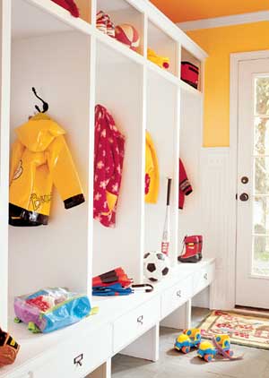
    And last but not least, a very classic mudroom. Clean, crisp lines. White paint. All-American kid accessories. Classic and Cute.

    My dream mudroom is a combination of many of these inspiration rooms. Although, as amazing as these are, there are a few reasons why I will never have one of these mudrooms…

    1. I have 4 kids… We will actually have mud and dirt in our mudroom.
    2. My 4 kids are MESSY. They might hang up their coats, but they won't precisely place their backpacks to look like acessories.
    3. Again, for some reason all of our belongings don't coordinate perfectly: )

    Do any of these mudrooms thrill you? Let us know which one got your juices flowing!

  • The Evolving House {C1's Bedroom}

    The Evolving House {C1's Bedroom}

    The evolution of a house and style is an interesting thing. I take great pleasure in changing, rearranging and tweaking the rooms in my house. My style has changed pretty drastically (since I basically started out my married life with no style preference at all), but I'm still developing my tastes and preferences. Things rarely stay the same for long, which is exactly how I like it. My desire is to create a home that is comfortable for my family and welcoming to guests, that is pleasing to the eye, but that is also practical for raising two kids. I'm fairly certain that this will be a life-long quest. However, money and time (or the lack there of) make it a little more difficult to decorate and change things like I'd like. Kevin and I have had a few rough years financially, and so, I am finding that if I want to redecorate, I have to be resourceful and creative, and most importantly, learn how to repurpose items we already have. I've been learning the very difficult lesson of contentment (Melissa, at The Inspired Room, said this about contentment that really resonated with me), and am realizing that I don't have to have the perfect house, just one that my family considers beautiful and can enjoy living in.

    With all that said, Monica and I will be showcasing our houses to you; not because they are perfect, far from it actually, but because they are a huge part of who we are. So, welcome to the evolving house.

    This is C1's bedroom. Just recently, we changed her over from a toddler bed to a full-sized bed. In one afternoon, it seemed like she grew older right before our eyes just because of the furniture! I love her room- it's girly and sweet, but can also really grow with her. We painted the walls a really pretty shade of green (I'm sorry I don't know the paint color anymore!), and we used all-white furniture. Every piece of furniture (except the headboard) is hand-me-down or was hand-made by my hubs. Her cute butterfly and flower bedding came from HomeGoods and was a gift from my mom. She has a great dormer window, in which Kevin built a toy box/window seat. When we were creating her baby nursery, I envisioned that little space as a great reading spot for her down the road. For now, she uses it to play and look out the window.

    This shelf came from my mom's attic (she has a great supply of decor and furniture she's not using and is really generous with it!). I made the monogram, using adorable patterned and hot pink card stock, and put them in frames we already had. I hot-glued ribbon to the tops to make them a little more feminine.This monogram project cost me no money at all, since I used items I already had! The little porcelain shoe to the left of the frames was a gift from her great-grandmother and has all her birth stats painted on it.

    This is my favorite feature in her room. Inspired by something I saw in Pottery Barn, Monica and I created a tree stencil for the walls. I then hand-painted the trees (there are two of them- one on either side of the dormer window area), and added leaves and pictures of our families to make it a family tree. One side is the hub's family, and the other side is my family. I wanted C1 to have an understanding of the importance of family, and how blessed she was to have such a Godly inheritance, from an early age.

    Isn't this chair the most precious thing you've ever seen? Ahh, I can't get enough of it, and you'd never guess that I got it at Big Lots for $40!

    But really, these pictures show what I love most about this room: My two kids living in it.

  • A Statement Piece

    A Statement Piece

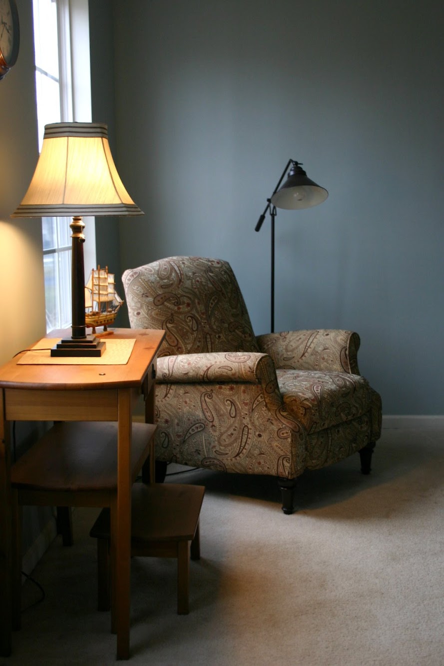
    Tap, tap, tap. Is this thing on? It is? Ok then, let's get started. I thought that for my very first post I would talk about my absolute favorite piece of furniture in our house. That this furniture became my favorite happened as kind of a wonderful accident. When hunky and I were moving into our current home, we realized we need to fill up some of the additional space we were acquiring with new furniture. If you know me, I am not too flashy, enjoy neutral colors and like traditional furniture with clean lines. However, I wanted an accent chair for our living room. We came across a lovely paisley fabric that was a bit more bold than the usual patterns I gravitate to. You know how you only get a 1x1 swatch of the fabric, and are supposed to be able to visualize the furniture piece with the fabric on it? Not all that easy, if you ask me. Well, we decided to go for it: put that pretty paisley all over that wingback, baby. And, what could have been an uh-oh-this-chair-is-ugly-but-cost-a-fortune-and-is-mine-no-matter-what chair, turned into one of the best things I've done in decorating. We've already made a bunch of memories on this chair, and some of my favorite pictures ever of C1 and C2 were taken on it.

    See what I mean? Worth the investment just for these three pictures! I did some searching and found some pretty amazing accent chairs. They make a huge difference in a room, don't they?

    Gilded Chair

    spaces design

    I just love the navy and gold combination in this room, and the subtle tone on tone pattern on the chair.

    Vanessa De Vargas living room

    living room design by los angeles interior designer Vanessa De Vargas

    And be still my heart, the patterened rug and chair combination in this picture rock my world.

    Pottery Barn
    I love the simplicity of this chair and the fact that it adds a bit of texture, instead of a bold pattern. Not sure why, but it makes me think of spring.
    So, what about you? Do you have a favorite furniture piece?

  • Rugs, Rugs, Rugs

    Rugs, Rugs, Rugs

    I've never bought a rug. Ok, that's not completely true: I've bought a bath mat. Does that count? And sadly, I'm probably a long way from purchasing one, but that doesn't stop me from dreaming. Thank goodness that a lack of funds doesn't keep you from dreaming. Can I get an amen? In my dream kitchen, I would have a gorgeous rug in the"breakfast area". Let me remind you of the direction I'm heading in with my kitchen:

    I'm on the lookout for a reasonably-priced rug that will bring in some light blue/aqua into the room with accessories and the rug. My first stop was RugsUSA. If you're not careful, you can get get swallowed up in an abyss of beautiful rugs and lose a few hours of your life, but thankfully, I came out alive with a few rugs I would love to have grace the floor of my kitchen.

    Of course, this Morrocan Trellis Rug is out of stock. But so pretty, right?

    This Keno Bold Floral Rug in Slate is my favorite of the whole bunch, and is 50% off right now! Only $120 for a 5x8 makes this beauty a great deal. It would look so fabulous in my kitchen because it sort of mimics the design of my stencil (the two would be across the room from each other, so the two patterns wouldn't conflict.) Love it.

    It's pretty obvious that I love stripes. Combine that with a nautical navy color, and this Boardwalk Stripe Rug is right up my alley. It would take my kitchen in a bit of a different direction as far as color goes, but I just might want to do that! (Considering I change my mind every 30 seconds…:)

    You probably have seen this rug before because it's a pretty popular Ikea rug called the Gislev Rug. Why is it so popular, you ask? It costs only $20 for a 6x4 rug! What?!! Besides being so affordable, our bloggy friend, Mandi, tweaked this rug with a little bit of paint and it looked amazing, so I'm pretty sure I could add some blue and it would be just right.

    This Bogart Flat-Weave Wool Rug from Garnet Hill features a modern interpretation of the Moorish Tile pattern and comes in several glorious colors. And it's on sale too! Plus, this was one of Oprah's favs so you know it's pretty cool. Duh.

    What about a DIY Rug?
    Jamie, from The Creative Imperative, sewed several Ikea table runners together to make one large rug for only $35! That's seriously tempting, people!

    Painting plain rugs is pretty popular in blogland right now, but this Painted Rug by Hayley Anderson really caught my eye:

    Again this rug is from Ikea, and you know I wouldn't use chevron (I've shared my feelings for chevron here), but the possibilities are endless if you're willing to tackle the project yourself. But isn't that the truth for everything?; )

    Am I the only person who has never purchased a rug?

    *******************************
    PS- Hey, this is Monica… I'm hacking into Jess' post. I need to throw out a plea for help. I need 2 BIG rugs. I have been looking for rugs larger than 10x12. My living and dining rooms have been waiting for rugs for eighteen months! So if you have any good, reasonably priced sources, let me know!!

  1. Craft Holiday - Fiber Art with Beryl Taylor
  2. Creative Holiday
  3. Textile Holidays
  4. Fabric Art Beads - recycled fabric
  5. How to sew - with Angie Hughes
  6. Leighton Meester: Marie Claire UK | Mode: Fashion
  7. Shannan Click: Vogue Latin America | Mode: Fashion
  8. Julia Hafstrom | Mode: Fashion
  9. Abbey Clancy | Mode: Fashion
  10. Bianca Balti | Mode: Fashion