It's true- most people have heard of vinyl peel and stick tile. We both have used it in our homes in the past. But, what's also true, is that most people have never thought to create an awesome herringbone pattern with that tile! These tiles are ridiculously easy to cut which makes it the perfect material to go crazy with pattern! We have to say that this floor is one of our favorite projects to date- we transformed this dated floor into an expensive, slate-look-alike.
To say this flooring was dated would be the under-statement of the year. It was yellow and green and oh so bad! Even though the kitchen was tiny, we didn't have enough money or time to go with real slate tile.
Instead, we got our DIY on… Lowe's sells lots of vinyl peel and stick tile and while it does actually look like stone, when installed the traditional way it looks good, but doesn't have a big wow factor…
So, we had an idea… This flooring comes in 18x18 tiles- we decided to cut each tile down into three 6" strips per tile. Vinyl flooring cuts easily with a utility knife- Just score it and then fold it to divide.
We cut down all of our tile into strips and then measured to find the center point of the floor. We used a chalk line to snap a guide for us to follow. Then, to give it a unique and high-end look, we laid the tile in a herringbone pattern. You just make"L's" over and over again. It's one of the easiest patterns to do!
How's that for a before and after?? And, honestly… these pics don't even do it justice! You definitely have to watch this segment of the episode! (Here)
I honestly was amazed and how good we made inexpensive vinyl look. It's like it was all dressed up for prom or something! Fancy!
Changing out the flooring played a big part in making this tiny kitchen renovation complete! No one would ever guess that this flooring was installed with some of the cheapest materials on the market! Changing the shape of the tile and the installation layout gave us amazing style, without the expensive price tag!
Last week we mentioned that we've been really busy working on this Pepto Bismol pink room. Trust me, I love me some Pepto once in a while, but on the walls… not so much. Does this guest room make you want to come and visit? I mean, look, it has it's own personal gym, cable TV, and extra pillows! What more could you want? We're talking 5 Stars Baby!
Ha! It's okay, I know the anonymous homeowners of this guest room and they don't mind a little teasing. Trust me, with how awesome the room is looking, last night Jess and I told them that we definitely want a sleepover once it's all finished! The grand reveal with come on April 24th, but until then here are some major spoilers! Drool-worthy hardware We are sooo crushing on the furniture upscale we did. It was incredibly simple, but makes a BIG impact!
Perfect Colors Have you ever walked into the paint department and felt like certain colors were just screaming for you to notice them? That's completely how this pallette came together. Jess and I met at Home Depot one night and honestly within 3 minutes we had our minds made up.
Umm Gears? Just wait and see. We're actually not 100% sure about all the details for this project, but we know it's going to be awesome. As we told the homeowners…"Trust Us"
Industrial Flair Notice a trend? One of the coolest things about this room is the awesome juxtaposition of styles. We're pairing some funky modern pieces with an amazing 18th Century find. Can't wait to see it all come together!
Honoring Service The homeowners really wanted to incorporate this picture of their grandfather, who served our country. I'm totally a non-emotional gal, but this picture sort of gets to me. One of my good friends Jane, would be so proud of me (she's uber emotional and loves all things military)!
Did We Mention Juxtaposition? Haha! From Army to Blue Birds in a single bound. Don't worry, we're not crazy (okay, maybe a tad) and this will all work out nicely!
Examples of Love & Commitment We have a very cool gallery project for the room. The homeowners (which btw it's really weird to refer to them as"the homeowners" and not just Connie and Mark… Oops! Did I just accidentally reveal their secret identity!) Anyhow… The homeowners had a collection of old wedding pictures from both sides of their parents and grandparents. They've had some amazing examples of what it takes to make a marriage work for the long run. They're going to have a special place to recognize that commitment and how God has blessed those couples in awesome ways.
Have you heard Jason Mraz's new song? I Won't Give Up is one of my top ten favorites right now and it's a great reminder that the road isn't always easy, but it's always worth it. Go listen to it and I'll warn you right now, that it will be stuck in your head, but it's a pretty good thing to be singing all day! So how's that for some spoilers? What do you think of the direction we're headed in? Did you love the Song as much as I did?
Only following on the blog? You're missing out. Use the buttons below to join in on all the fun!
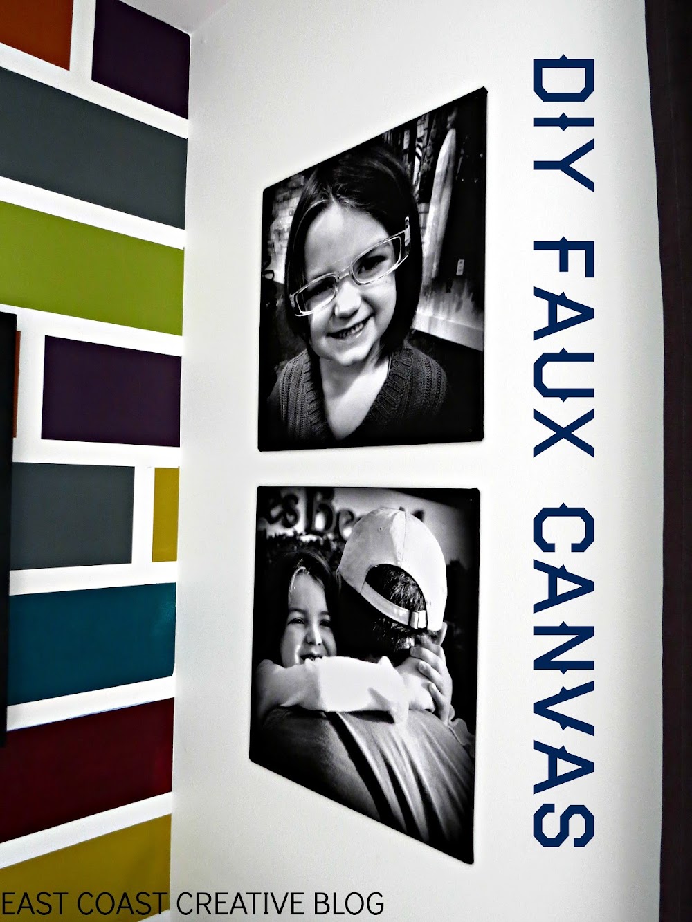
I'm excited to share one of my favorite projects from Kira's Room Makeover today! These faux canvases make an awesome impact on the room and man alive do they make me smile! Everyone knows that Jess and I are slightly obsessed with Staples' Engineering Prints and this project just added one more reason to love them!
Oh, and if you haven't seen the rest of the post for this room makeover, you can check them out here: Room Reveal & Video Mosaic Accent Wall Whiteboard Wall
This could perhaps be the easiest DIY on the planet and, I think I might have said that about a few projects before, but really it is! Here's What You'll Need: Staples' Engineer Prints Foam Core Scissors Tape The first thing I did was to edit and crop my pictures into squares. Next, Jess cut down the foam core into squares (we needed 4)
We placed the prints over the foam core and left plenty of extra on all sides so that we could basically wrap it like a present.
To hang these canvases, I nailed directly through the foam core into the wall. The nails barely show (I used really thin ones), but you could use chunky ones for an industrial look, or Command Strips for a more polished look.
Don't they look awesome? Kira LOVES them and I do too. The bottom picture is of KJ and her Papa while we were waiting for the gates to open at Disney World last year. The look on her face is priceless!
And oh.my.word- Those Converse with her skirt rock my world! This little girl has so much spunk and personality and I just love that this simple DIY project captures that.
You can check out some of our other Staples Prints Projects: Huge Family Art for Under $20
Garage Artwork for $6.99
Ginormous Family Art
So tell me, do you have a have a place in your home where these faux canvases would be an awesome addition? P.S. Jess and I are pretty excited to spend the day FILMING something amazing on Monday. We are bursting at the seams to tell you all the details, but our lips are sealed… for now!!
Yesterday, I shared my daughter Kira's Colorful Bedroom Makeover with all of you. Check it out here if you missed it. It's interesting when you're doing a room for a little person… there's this part of me that wants to go all crazy blogger-designer-nutso on the space, and then there's the realistic mom side that reminds me that her room will be a disaster of toys in about 3 minutes flat and that I don't need to go over the top to make her happy. Honestly, I'd kind of be going over the top just for my own self-interest. So, with that being said, the mommy voice won out and I went with a fun, yet practical room makeover. I'll guess I'll save up the glitz and glam for the master bedroom (if I ever do tackle it!).
Today I'm going to share with you the focal point of the room… The Mosaic Accent Wall!
I'm a total sucker for an accent wall. Honestly, since I was a junior in high school I've been whipping them up! My very first was a blue feather dusted wall in my parents' house. Then, I did a pretty cool square grid wall (again at the 'rents house) when I was a senior. Kenzie's first bedroom had vertical stripes and stars, then I changed to a fun magenta gingham. We had an argyle bedroom too! I wish I had pictures of all of those, but it was in the film day and age- boo! Enough of the trip down memory lane, let's get going with the tutorial! How to Create a Mosaic Accent Wall Since this is the room of my 5 year old, I asked her what she wanted, and she told me LOTS of colors."Mommy, I want purple, blue, green, orange…" and the list went on and on. I thought about it and finally decided, I could give Kira exactly what she asked for- lots of color!
I bought a sample size of each color and a gallon of white paint to use as my base and for all the other walls. One word of caution, Valspar sample paints do not have the normal bonding agents that regular paint has. It will require more coats for solid coverage. Just keep that in mind when you're planning a project. For me, buying 8 quarts wasn't an option (this was a makeover on a budget) and I'd rather have to do a few extra coats of paint. I had JUST enough- it was close, but we stretched the samples far enough.
This unfortunate event occurred as soon as we got home with the paint. Grrr… I was sort of hoping Hurricane Sandy would wash some of the stain away a few weeks ago- No.Such.Luck! Blogger Fail!
Here's my supply list: Valspar® Sample Paints Base coat paint Purdy® Paint Brush Chalk-line (a DIYer Must Have!) Tape Measure Pencil Frog Tape® Mini Rollers Paint Trays
I had to get rid of that BRIGHT aqua color and amazingly, the Valspar white paint & primer in one did the trick! I was left with a blank"canvas" and two weirdos (the hubs and my oldest)!
There are all kinds of approaches to getting perfectly straight painted lines, but I really think we use the BEST method. I'll tell ya about it, and then you can be the judge… 1- Measure out your stripes and put tick marks on both sides of the wall.
2- Use a Chalk-line to get Perfect Guide Lines- Simply, put the string directly on the tick marks on both sides of the wall, pull the string taut, and snap that baby! It is so much MORE accurate and FASTER than using a level and a pencil. Let me remind you of something… you've seen how awkward I am at dancing… would you trust me to use a level on wall stripes? I think not.
These bad boys are crisp, straight and ready for some Frog Tape!
3- Use Frog Tape to Divide your Stripes. When I'm working on an accent wall, I know it's going to be the main focus of the room, so I have to have crisp, perfect lines (yes, perfectionist tendencies admitted).
My hubs uses a few pieces per stripe, but I'm a one stripe wonder. I definitely prefer to do the entire stripe with one piece to make sure there aren't any uneven seams. Also, make sure you tape off the two side walls.
I love me some stripes!
After all my horizontal stripes were finished, I randomly placed my vertical dividers. I toyed with using a mini level to get them perfect, but then decided I could do it well enough by eye. Please ignore the epitome of frumpy DIY clothes, no shower, and tape on the leg.
Whenever I'm working on a project like this I rip off a bunch of pieces the length I need and keep them on the wall so I can get to them quickly, if I'm not using that method, I keep the roll of tape on my arm. Works like a charm.
4- Paint the Edge of your tape with your Base Color. It's one extra step, but it's the MAGIC INGREDIENT to perfect, crisp lines. Frog Tape alone is excellent, but on an accent wall like this, I had to be sure everything would be perfect. Just take your base coat color (whatever color is under the stripes) and with an semi-dry brush (not dry, but not sopping wet either) paint over every edge. I don't recommend using a roller for this step, I always use a paint brush.
It makes the wall look a little scary, but it will all work out in the end! Allow it to dry- I gave it about 40 minutes before putting color over it.
I had a tray and roller for each color. I wanted to work in a random pattern and that meant making decisions as I went along- no time for washing rollers and brushes.
Finally, it was time to put some color on the walls!
If you want a random look (like mine) I'd recommend working in one section at a time, mixing your colors as you go.
Because of the sample paints, it took 3 coats per square. It was a tad scary at first, but by the second coat, I was confident the coverage would be good.
Jimniy Cricket- Even before I removed the tape I knew I was in love!
Now, for the Moment of Truth-Removing the tape… Once again Frog Tape & the Mangin Method = Perfection! Seriously, I do a cheesy dance (you can picture it) every time I remove tape from a project! I do recommend removing the tape as soon as you're done-I don't wait for the paint to dry, and I remove it VERY slowly and evenly.
Here's the finished product! It was so simple and took me and Eric about 4 hours from start to finish.
Here's a before and after…
It's a lot of color (as requested by Kira), but I like the extreme contrast that the white walls bring. I also could totally picture doing this with muted tones or even all in one color with an ombre effect!
Almost every morning, I find KJ hunkered down reading books in her PJs… She loves her new room!
Tomorrow, I'll be giving you all the details on the whiteboard wall and Wednesday one of our favorite things… DIY faux canvases with Staples prints! Make sure you check it out! What do you think of the accent wall?Have you ever tried something bold with paint?
November marked 2 years in our"new" house. I can't believe it's already been two years, and at the same time, it feels like we've always lived here! Before we moved in, I quickly painted each of the kids' rooms in a solid color and did very minimal decorating. Last year, I did Callen's room with the fun Pallet Wall, but he's the only one that has a"cool room" as my kids say. Kira was next on the list for a room makeover and thankfully, it's already gotten the"cool room" stamp of approval from my kids!
This room makeover was part of one of my projects for P&G. It was my first video for those readers, so sorry about the introductions, but this video does give you a great little room tour! (Excuse the creepy freeze frame… why does Youtube do that?)
Here's a still shot before and after
Pretty Big Difference isn't it? I can't wait to share all the fun projects and DIY details with you- I'll be featuring one project each day this week, but for now, here's ton of pictures!
I grabbed this adorable little hooter at Target. The mirror was something we DIYed about 8 years ago, yup, we DIYed before DIYing was cool!
Little Book Nook!
Spray paint and round bulbs make all the difference! All the color details coming later this week.
And this is the other side of the room! Helloooo… huge whiteboard wall! As you heard in the intro video, KJ had a tendency to write all over the walls. We now have a dedicated place for that! Wednesday you'll get all the product info and tutorial for this.
A little DIY took this dresser from boring to custom-ish!
For P&G I can't have any pictures showing, so I left Kira a little note in this cute frame instead.
Creative coloring storage!
Masterpieces from my little artist
Now that you've gotten the quick tour… Here's the plan for the posts for this week… Tomorrow (Tuesday) I'm going to give you all the details on this stinkin' awesome mosaic accent wall. I'm not sure I'm allowed to say something I did was awesome, but man I love it!
Wednesday, I'm going to tell you all about Idea Paint and how it can turn almost anything into a cool whiteboard surface!
Thursday, it's more Staples LOVE and I'll give you the 411 on these foam core faux canvases. And to think I almost bought 4 frames at 39.00 each! The entire project ended up costing me under $25!
There's actually one REALLY BIG step left before this room is finished. You might have been thinking that the walls are a little too plain and white, and I agree! They won't be that way for long! One crazy-talented Art Teacher from my school, who Kira has now titled"The Artist" is coming to doodle on the white walls with paint pens! Kira has all sorts of fun, things she wants doodled… peace signs, butterflies, and flowers are at the top of her list."The Artist" and I are coordinating our schedules, but once we do I'll be sure to do an update post! Until then, make sure you check back this week for all the tutorials and fun details of the room! So what do you think of my colorful bedroom makeover? Any favorite parts? Do tell!
This day seems like a long time coming. It's the first time I've completed a nursery AFTER the baby was born. Ha! (If you missed my baby announcement, you can see it here) Doing this reveal today- October 1st- is sort of ironic, since this is the day I was due! I'm so happy I took my time to finish it because I'm really happy with it! It's not perfect- is any room ever really perfect??-, but it makes me smile and will be a great space for Bennett… when I can part from him.; ) I hope you're ready for a whole slew of pictures. Sit back and enjoy!
Come on in!
This room is nothing like I originally envisioned, but one thing that stuck is the color scheme: orange, mint and gray. It's so fresh, bright and a little quirky.
Isn't that little Bennett burp cloth adorable? My friend Karen from Thread Blossoms made it and I never want to actually use it- it's too cute!
Free printables are a great way to dress the walls in a nursery- (you can see my round up of fun printables here.) I added the printable on the far left from The Handmade Home, and I love it! The rocking chair has been in my family for years, but I just recently decided to make it work in the space by painting it in Annie Sloan's Graphite chalk paint. The abstract art was custom-made by my cute kids (more on that later!)
These cube shelves are from Ikea- Monica actually hung them during our first Nate's Crate challenge on The Nate Berkus Show. They totally look like built-ins and fit that little nook perfectly.
This room doesn't have a closet that we can use, so we purchased an armoire from Ikea to hang some of Bennett's clothes. When you sit in the rocking chair, you kind of stare right at the side of the armoire, so I hung an old print that was in my nursery as a baby, after painting the wood frame in the same graphite as the chair.
I've had the coffee sign for several years, but I moved it in the nursery because I thought it was kind of funny…if you've ever had a newborn, you know how much caffeine you need!: )
Oh, the dresser. This dresser is fabulous, isn't it? It was my grandparents and I totally wasn't sold on it at first, but we were trying to do this room on a budget and it was free. Done deal, folks. Now, I am in love with it! I'll share the details in another post, but with some paint and wax and a pop of orange paint on the legs, it was turned into the best part of the room!
I thought the"Oh Boy" was so appropriate for two reasons: 1) we were having a boy (duh!) and 2) we were taken so by surprise with this pregnancy. It makes such a statement and adds a whole lot of personality to the room!
I added some washi tape to the plain black lamp shade to add a little interest. Man, I love washi- is there no end to it's many uses?
Bennett isn't spending too much time in this room yet, but I'm pretty sure he's excited about it!
I hope you love it as much as I do! Tell me…what's your favorite part?
Sources Sheets: Target Rug: Ikea Changing Pad Cover: Babys R Us Dresser Paint: Annie Sloan Graphite & Paris Gray, Dark Wax Giant Letters: Hobby Lobby Dresser light: Target Color-blocked baskets: Target Copper Light on bookshelf: Local antique shop Armoire: Ikea Bookshelf cubes: Ikea Rocking Chair: Hand-me-down Mirror: Walmart Coffee sign: Vintage sign store in OCNJ
Have you ever looked at your house and thought, well… this is just what it has to be. I can't do much to change it. That's exactly what we heard from Terry, the homeowner of this episode of Knock It Off. I should mention that even though she wasn't liking much about her house, she had the most meticulously clean and cared for home- I want to be like her when I grow up! Now, back to the design- Terry had dark wood everywhere (which some peeps love, but it was dragging her down), wallpaper from almost every decade, and just not a whole lot going for them… Or so she thought!
See what I mean? It's just not the kind of room that inspires you to"Be Awesome" on a daily basis. So, Jess and I decided to take this room from dreary to cheery (yes slightly cheese ball-ish) with a really fun, bright color palette.
How's that for bright and cheery and just overall awesome?!?
We love the impact an accent wall can have and after we removed the circa 1970s wallpaper, we knew that a Royal Design Studios stencil was the way to go! We'll be posting on how to remove wallpaper (we know you want our tips and tricks!) and all about stenciling an accent wall. For now, just enjoy the eye candy!
Terry's family room connected directly to this tiny sunroom she uses as an office and study area. We didn't have money for new chairs, but we were able to build a bench seat (all we needed was wood and 1 piece of drywall! Tutorial coming soon!). We tossed on a few World Market pillows that were on major clearance and we had ourselves a super inviting sunroom! I literally had to pull Jess away from this comfy seat to keep working!
We worked with furniture Terry owned, like this gem and just gave it a new sassy swaga with some paint and two pieces of hardware. If you have a piece of furniture that seems beyond dated, just try giving it a bold color paint and see what happens- it's kind of like magic!
Some of Terry's furniture we used (like the adorable table we upcycled), but other things like the huge ottoman they had, had to go. Instead, we built our own table using 2x4s and 2x6s. This piece looks so expensive because of the X frame, but it's easy-peasy to build (tutorial coming soon!). I think my favorite thing from this episode was seeing how empowered Terry and Jesse felt. I sound all Dr. Phil, but I'm serious! They thought they just had to settle for how their house was, but now they know the awesome potential it has! Since we filmed that episode Terry has sent us pictures of other furniture they've upcycled, and she's painted her dining room walls and all the trim! Jess and I feel like proud Mamas! So, no, we can't come to every single reader's home (we wish we could!!), but hopefully by seeing what we're doing with homeowners on Knock It Off, you're feeling like you don't need to settle either! Here'a a little more before and after action for ya!
Hello adorable sunglasses pillow! Thanks Homegoods for always having amazing things to use in our makeovers!
See how the little sunroom flows right off the family room?
If you missed this episode, what are you waiting for? Click HERE to watch it online! We promise we'll get all these tutorials to you really soon! I mean with our amazing intern Diana, is there anything we can't do??: ) She's the best! What do you think of this makeover? Do you have one of those rooms in your house where you just feel stuck? Do Tell!
You might remember that last spring I gave my front porch a face lift. I love the door, the planters, the numbers… I love it all! BUT… no one ever comes through the front door. We're those laid back friends where you can just swing by unannounced and you'd never dream of coming through the front door- and that's how we like it.
However, what we didn't love was the hideous garage entryway that we were making our poor friends and loved ones endure…
In my defense, we have a Bernese Mountain Dog that gets MUDDY in the spring, but still, it was nasty! We also had a bit of a shoe issue… Basically our kids never put them away! Grr! My hubs was going away for a few days and I decided that a garage makeover would be a perfect birthday present- he was coming home on his actual 30th birthday. In 48 hours that tested me as a DIYer and a single mom, I managed to get the reveal done in time!
Isn't that SO.MUCH. BETTER? I love that it actually reflects what you're going to see when you get inside our home (not just a mud pit) and the hubs loves that the shoe issue is taken care of! Here's what I did…
I'll be completely honest here for a second too… the shoe bins actually work! Only once or twice have I had to remind my oldest (of course it would be the oldest) to put her shoes away. It's so practical and awesome!
I'm calling this a REAL LIFE Garage Mudroom Makeover because I was not going to go all out and spend hundreds of dollars on a garage- it's a Garage! I love some of the pictures I see in magazines and on Pinterest where every little detail is exactly perfect and pristine, but news flash… I don't live in a magazine… My 4 kids are messy, my garage is usually housing a DIY project, and is being spray painted in all the time. I wanted a makeover that looked good, but was realistic and not fancy just for the sake of blogging it. Here's an example… I could have painted the garage floor and it would have looked much cleaner, but really- spend time painting a floor that will get dirty or have fun with my kids? I went with the kids and I'm happy about it. So, I hope this inspires you to be willing to try a project- it doesn't always have to look Pottery Barn perfect. Okay, off my soap box… Here are some more fun elements…
The rest of this week, I'll be sharing the tutorials for all the projects in the room. Lockers, Custom Rugs, Foot Artwork, and more! In the meantime, I have one final detail to finish… I am going to add some vinyl words to the door. We have a no knocking policy in our house. Honestly, there's one of Kaden's sweet little friends that always knocks when his family comes over and I give him such a hard time! (Matt, if you're reading this- no more knocking!) So, what I want to put on the door is something about friends and family not knocking, but I can't come up with a good way to say it. Can you help a girl out?
Leave me a comment if you have any ideas! I always get so inspired by all of you! What do you think of my Real Life Garage Makeover?Stay tuned tomorrow for tutorials! Linking to:
Outdoor furniture can cost an arm and a leg. Since I'm not interested in selling my firstborn to afford nice furniture, we often build it ourselves- and we do the same thing with homeowners on Knock It Off. We wanted to build Barb and Derek a sectional for their sunroom that would have a high end feel and not the price tag.
Doesn't it look great in their finished sunroom?
We are huge fans of giving credit where credit is due- Ana White is the queen extraordinaire of all things DIY furniture! Her blog is full of FREE furniture plans and one of her projects inspired our outdoor sectional.
We didn't use Ana's plans exactly, because we wanted it a certain size for Derek and Barb's room, so we came up with our own version, but if you want to make one, you should follow her step by step directions with awesome pictures!
Ana's plans for an outdoor sectional can be found HERE and you can download a PDF with everything you'll need. A few tips for making one of your own… # 1- Have the right tools! You don't need anything extravagant to build this sectional, but a strong drill, a Kreg Jig, and a Chop Saw are essential.
A Kreg Jig is a great, inexpensive tool for building furniture. We used one when we built our farmhouse table, outdoor table, garage lockers and so much more.
It creates a pocket hole to hide your screws.
You can check out Kreg's website here (and no, this isn't sponsored, I just really love this tool!!) # 2- Have a friend to help! this is a two person job. There are lots of times where you'll need one person to hold and the other to attach something.
# 3- Use Exterior paint or Stain with a Sealant For our sectional, we used exterior paint, but watered it down a bit, so we could still see some of the wood grain. It's a little trick if you're in a time crunch. It spreads easily, like a stain, but you don't have to do an extra coat of sealant. We've learned lots of quick trips doing rooms for Knock It Off.
This project looks amazing and expensive, but it's really simple and a good first project if you're wanting to try your hand at building. All the cuts are straight and the plans are simple (you can thank Ana White for that!)
If you want to see how this sectional looks in the room, click HERE to watch the full episode online.
Hopefully this project encourages you to take that first step and give building your own furniture a try! It will save you a ton of money (maybe even your firstborn!!)
We were really excited when we heard about this screened in sunroom needed a makeover! We hadn't tackled an outdoor space yet for Knock It Off, and we were bursting with ideas. Here's where things started…
And here's where we ended up… We created a space that was fully comfortable, much more weather-proof, and filled with style- all on a small budget!
Soon we'll post tutorials for the sectional, plant wall, how to paint siding, and the painted rug, but for now, here's some eye candy from the makeover! This drink station is actually a fold down table. When it's not in use, you can attach it to the wall and it looks like artwork. It was incredibly simple to make and such a great thing to have for entertaining.
We wanted to set this space off as a room of it's own, so we went bold by painting stripes on the exterior siding. It added a huge pop of color and just made the space super cheery (and I know that sounds cheesy, but it's true!). The plant wall was much cheaper than large artwork and also helped with our goal of bringing the outside in!
We were excited that we not only gave the homeowners an entire sitting area with the sectional, but we were also able to give them a little dinette where they could enjoy a meal (or soft pretzel!) outside!
These solar lanterns are from Ikea and you should see how fun they look at night! We added so much mood lighting that we almost wished we could have revealed the room at night! Our producers told us night reveals are a no no: )
And the sectional… ahh we loved how this turned out!! We know many bloggers have built outdoor furniture, but this was our first attempt at it (we didn't mention that to the homeowners of course!!) We basically decided how large we wanted the sectional, did a lot of math to determine how big each piece should be, and then crossed our fingers. Amazingly, it was really simple to build once we had a plan! We'll write a full post on our build within the next week!
If you missed this episode, head over to The Live Well Network for our Knock It Off Page. You can watch the full episodes online HERE.
Stay tuned for all the tutorials coming to EC2 in the next week or so!! Do tell, what was your favorite part of this Sunroom Makeover?
If you missed it, last week we had the chance to complete a 30 minute White Box Challenge in front of 450 women! It was so much fun and pushed our DIY skills to the max- 30 mins feels like 2 seconds when you're working on an entire space! Here's the before and after- to see the full post about the challenge, click HERE.
Throughout the evening, we upcycled and hacked our way to a completed room, but there are so many other great ideas for these inexpensive pieces, that we just had to share! So get ready for… 25+ Upcycles and Ikea hacks!
First up… the Ikea LACK side table. The Lack table is a DIYers dream because the options are endless!
Here are 3 of our favs… (Click on the number to see each full post from the source) 1…2…3…
At the event, we turned ours into a tufted ottoman! (Tutorial coming later this week!)
We LOVE the Ikea Rast dresser because it's under 40 bucks!
How fabulous are these hacks? 1…2…3…
We combined two Rast dressers, added new hardware, some metal detailing and had ourselves an awesome buffet!
Here's a generic accent chair. Ikea has lots of different styles, but left alone, they're pretty plain…
These chairs went from drab to fab with a little DIYing. 1…2…3…
We paint dipped the legs a bold orange and added gold nail heads to add a punch of style!
Rugs can be expensive! One of our favorite places to get them cheaply is RugsUSA.com, but another way is to buy a cheap outdoor rug and paint it yourself! This one was $19.99 at Home Depot!
It's amazing what a little paint can do! 1…2…3…
We added wide stripes to our rug for the white box, but in our hurry to get the room done, I may or may not have walked across the wet paint! Oops! No pics for you!
Okay, isn't this creepy art awesome?? Well, you might not have something this creepo, but you can score great art at thrift stores or upcycle a piece you already own!
Each of these projects use paint to tone down the"creepy art" factor! 1…2…3…
Here's what we did with our blah artwork…
Target and Walmart sell book shelves so inexpensively! The problem… they look inexpensive!
How about these ideas for fancying up your shelves? We love every hack Kate from Centsational Girl has ever done! 1…2…3…
Almost everyone has a dated lamp around the house- and if you don't you can get one any Saturday at a local yard sale!
Here are three fun ways to spruce up those dated lamps. 1…2…3…
For ours, we replaced the shade, added some ribbon, and spray painted the base.
Pictures of family and friends are awesome, but here are some outside the box ideas for your extra frames!
I'm a huge fan of what Lindsay did with her open frames! 1…2…3…
And what would a post on upcycles be without mentioning pallets? 2012 and 2013 were the years of the pallets!!
Here's a variety of ideas from walls, to plants… 1…2…3…
We used a pallet to make a simple shelf- unfortunately, we didn't bring any mags, so in 30 minutes… scrap paper and Bibles it was! lol!
So that should leave you on Upcycle and Hack overload!! Have you ever DIYed any of these items before? Do tell!!
Friday night we had the awesome privilege of being the special guests at Calvary Church of Souderton's Ladies Night Out. We were asked to come up with something involving DIYing and be super entertaining while 450 women looked on… yikers, no small task right?
We chatted about it a bit and then decided we were up for another White Box Challenge!! If you missed our first one with Nate Berkus, you can check it out HERE. We set up a Plain Jane, Ho-Hum room, talked through each project, starting it on stage in front of everyone, and then had 30 minutes during intermission to actually transform the room. Yes, we know we're completely insane!!
We wish all of you across the country could have come to the event- it was SUPER fun, but since you couldn't- we thought we'd share some of the fun with you!! One of the first things we talked about was using what you've got. We've all got"mad skillz" but my skillz are probably pretty different than yours. Rather than feeling like you've got to fit into a perfect mold, instead, find a way to use what you're good at- and what you most likely love- to help others. Sometimes we fall into the trap of thinking we need to serve in the traditional ways i.e. church nursery, ushering at church, helping at a food bank- and while all of those are awesome and perfect for some people, God might have gifted you in a different way, to do different things. For some weird reason, I can make rooms look pretty… not your typical serving"gift", but Jess and I have been able to use it in awesome ways- decorating the women's recovery center, Jess did the children's room at her house, our Design It Forward projects etc… Bottom line: Use what you've got, don't try and fit into someone else's mold- God wants to use YOU with the cool talents he's given you.
Then, we talked about using what you've got in your home!! We all have rooms in our houses that we'd like to change, but odds are we don't need to go out and start from scratch- so we explored ideas for making generic items awesome!! The biggest things to remember hear are #1- Don't be afraid to try something!! Working on Knock It Off, we're now 100% convinced that fear is what holds peeps back from making their home exactly how they want it! #2- Your home should reflect YOU! It doesn't need to look like a Pottery Barn catalog (although those are pretty)- it should be a place that YOU love. If that means a green piano, then go for it. If it means neutral, planked walls, then have at it! Whatever you do, just make sure it feels right for you and your family.
So, here's where our room started off… (We actually struggled to make it look"bad" Jess kept staging things nicely and I would go through and mess them up on purpose!)
The space was fine, but kind of blah- no real personality at all… Now, please forgive me… this is a blogger foul, but the after pic is from a different spot- you don't get the full room. There were 450 ladies in the room at the end and I couldn't get off stage to get a good pic. My bad! BUT…Here's the room after our 30 minute makeover!
Just a wee bit better eh? Here's a bit of a before and after all you can eat buffet, and we'll be back later this week with more project how-to info! Ikea RAST dressers are under $40 and you can do so many things with them! Here it is BEFORE…
And AFTER… We combined two to make a fun, color blocked buffet.
And in case you didn't notice… we found the biggest shade this side of the border!! We picked up this baby at a thrift shop…
We knew it had potential, it was just being hidden by a 10 foot shade… it was like a"shade-nado" Ok, bad, lame joke sorry! With some fun orange spray paint and a new shade trimmed with ribbon, it looked much better!
My official survey showed that 8/10 households has at some point owned an Ikea LACK side table. I mean at $7.99 it's almost impossible not to buy one. The problem is that it SCREAMS Ikea more than any other piece.
The good news… it's one of the easiest Ikea pieces to hack! We turned ours into a tufted ottoman with this gorgeous Ikat fabric (we got it at Joann- use a coupon to get the great price we paid!)
Another common Ikea piece is this chair… Again, so cheap, but sadly, looks it.
We added nail head detailing and paint dipped the legs in the same orange as the lamp. Added a fun pillow and suddenly this Ikea chair isn't so generic anymore!
Art can be expensive and unless to want to unload tons of cash, it's usually pretty generic. This is just blah artwork you could find at Target, Kohls, etc…
We used letters cut on paper, some spray adhesive, and spray paint to make our own custom art. The options are endless with this project.
How 'bout that for some fun before and afters?!? And honestly, every project was started live on-stage and then we finished all of them, painted the top of the wall, and added chair rail in 30 minutes! It was insanity and oh, so awesome all at once. We couldn't have done it without the help of some awesome volunteers!! Our blog readers rock and 3 awesome ladies worked behind the scenes to have all the projects ready to go for intermission. Dana, Beth, and Donna were great to work with and plus, we love meeting readers in real life!! Thanks again ladies!! Also, our carpenter and friend Matt made our entire white box before the event and then installed a chair rail and painted the teal walls during intermission in about 5 minutes flat! Matt's in the Philly area and does amazing contracting work! If you need a project done- he's our #1 recommendation! You can reach him at mattvapps@hotmail.com Tell him we sent you!!
So, all-in-all we felt like the event was a success. We loved the challenge and thrill of doing a room live, but more importantly- we LOVED being able to challenge so many women to use what they've got in their homes and also in their lives. We're honored and feel pretty darn blessed to have been given this opportunity. Check back later this week for project how-to's and other inspiration ideas for these pieces! If you were at the event… what'd you think? Are you ready to try some DIY in your own home?
This bedroom makeover was so fun to work on because we were challenged to combine both rustic and industrial styles together to make the space work! This room was huge, so we were able to do lots of fun DIY projects. Take a peek…
Now, to fully appreciate this room, you've got to see what it looked like before we started…
Talk about a transformation right?? You can watch the full episode online by clicking HERE. We had a blast working with Tiffany and Jon and were so glad they BOTH liked the finished room!
Later this week we'll post all the juicy details about all the projects in the room, but for now, here's just a little room tour for ya…
This world map project wasn't featured in the show much (there's just never enough time), but we loved how it turned out and it might be one of my favorite projects of the makeover!
After a fun trip to one of the BEST salvage shops around, we built these reclaimed wood floating shelves using conduit pipe! The awesome shop we went to is Architectural Antiques in Bedminster, PA. Click here to visit their Facebook page for more info!
Using a mantle we found at the salvage shop, we used wood slices to create a faux fireplace look. It really helped define the sitting area we created!
One of our wildcard projects (AKA we'd never tried it before and just crossed our fingers it would be awesome) was our metal headboard. Toilet bowl cleaner and inexpensive metal sheets never looked so good!!
And stealing the show… herringbone barn doors with a custom made track for UNDER $200! I love how these doors are barn, but with such a modern twist. The yellow color and the arrow pattern made these doors super unique! So, go check out the episode HERE, and then check back this week for all the complete tutorials!!
We've gotta know… What project is your fav? Any you'd like to try?
It's kind of a bummer that kitchens are usually the hub of a home and at the same time, they're the most expensive room in a house to remodel!! The good news is that we found ways to DIY almost every item in this galley kitchen and did the entire makeover on a tiny budget. Today we're going to share with you how we took the kitchen cabinets from dated, pickled wood to classic, crisp white!
To watch this full episode online Click HERE!
This was the cabinet situation when we arrived. I really wonder why on earth pickled wood was ever a trend?!? I'm sure in a few years, we'll look back on lots of our design choices and wonder the same thing.: )
Other than this one cabinet, all the rest were in good working condition. We also got lucky that the style of these cabinets was pretty simple and classic. No crazy scroll lines, just clean and straight- perfect for a paint-pick-me-up! The hardware however… that had to go!
The finished look was insanely different!!
Now, we're going to share some basic tips for painting your cabinets, but Jess also did her entire kitchen white last year, so at the bottom, be sure to click through to her post for a really detailed tutorial! 1. Remove the cabinet doors from the frames. Take off all of the hardware at this time and put them in a safe place, if you’re going to be reusing them. We did reuse the hinges for the cabinets, but that was it. 2. Set up a work station where you can lay out all of your cabinets at once- this is the fastest way to get all those cabinets painted as fast as possible. We like using plastic folding saw horses with 2x4s laid across. They're light and easy to move around. We got ours at Lowe's for $49 for a set of 2.
3. If you’re cabinets aren’t super glossy, you can use regular old steel wool to rough up the fronts of the door. You just want to make it so that the paint adheres. If you’re cabinets are glossy, go ahead and sand them. You won't regret doing this step right- it will determine if you have paint chipping in 6 months or not.
4. Wipe down the cabinet doors to remove all dust. Make sure you use paint plus primer to get the best coverage. Using foam rollers designed for cabinetry, roll on the paint in even coats, making sure to not drip! For Linda's kitchen we used Valspar's Summer Grey in Semi-Gloss. It reads like a white, but looks just a little moodier: )
5. Once the paint has cured for the recommended time, flip them over and repeat the process on the insides of the doors. 6. When your doors are drying, head back into the kitchen and rough up the frames of the cabinets with steel wool and paint them, as well. Once they’re dry, rehang your cabinet doors.Reattach the hardware, or install new hardware. This is when you can step back and admire the way your kitchen feels completely transformed!
Check out Jess' kitchen makeover with a full breakdown on how to properly paint your cabinets.
It's amazing the difference a coat of white paint can make! For about $30 you could completely transform any dated kitchen!! To watch this segment or the full episode- click HERE! Stay tuned for these other DIY tutorials coming to the KIO DIY Page soon!
For this makeover, we had a little boy that loved Pirates of the Caribbean (I love it too, but probably more for Johnny Depp than the actual movie! Ha!) He wanted a bedroom that was fit for a pirate, so we quickly decided to transform this room into a bunk on The Black Pearl! Two days, and lot DIY projects later we had ourselves a pirate ship!
The tricky thing with any themed room is the fact that kids grow out of things quickly. Who knows, next year it might be space aliens! We wanted to create a room that felt authentically like a pirate ship, but also could grow with Jack.
The nautical elements in this room are classic and could easily be swapped out to whatever his next phase is. For now it's all pirate!! Garrr!! Here's some before an after action for ya! Before
After
Before
After
To check out the DIY projects in this room Click Here
Nothing says city style like a cool, exposed brick wall… but bringing in real brick for this nursery makeover just wasn't an option! We decided adding faux bring paneling was the best option! This is a great project if you want to add some character and style to your home without spending a lot of money.
How to Create a Faux Brick Wall Lowe's and Home Depot both sell faux brick panels for about $15-$25. I'll be honest, they're crazy ugly when you get them- they need some paint STAT! But, they're affordable and look awesome when they're finished. 1. Measure your wall space to determine how many panels you’ll need. Each brick panel comes in a 4x8 sheet. They're usually in the lumber section near paneling.
2. Paint the brick to your desired color. These panels often get overlooked because they have a super-outdated red, brick finish, but they can easily be changed with regular, old wall paint! We chose to roll our panels with a base coat of white, and then add a fun pop of color with aqua spraypaint over top. If you want a rustic look, go for uneven coverage, letting some of the white show through. If you’re going for sleek and modern, go for full coverage with your spray paint.
3. Create a template that includes any special cuts (like outlets, light switches or pitched ceiling lines) you’ll need to make before installing the panels. We just used leftover cardboard that we placed on the wall, traced the line of the ceiling with a marker, and cut using a straight-edge razor. Using your template as a guide, make cuts on the panels as needed with a jigsaw.
4. Place painted panels on the wall and nail into place using a nail gun, or a hammer and nails. Caulk any seams or spaces along the wall and ceiling for a finished look. Easy peasy!
There you have it- you just added instant character and interest to your room without ever having to lift a brick!; )
To watch the full episode of this nursery makeover, click Here! There were so many fun projects in this room!
If you're looking for another creative wall treatment idea, check out this project: Planked Walls with Exposed Studs
High end built-ins can cost a fortune, but by using existing pieces of furniture as our framework, we were able to Knock-Off an awesome look at a fraction of the cost! This one project really made this makeover complete- without it, we're pretty sure the room would be a little blah.
To begin, use store bought cube units as your base for the bench seat- you can get these at many stores now, the only think to make sure of is that they’re pretty heavy duty- we don’t want a flimsy bench now do we?!? Ours are the Expedit cubes from Ikea.
Connect the cube units together to make one long bench seat. We just used a drill and a few long screws to do this.
On either side of the cube unit, add two store bought bookshelves (you can find the ones we used here). The height will depend on your ceilings and if you want them to go all the way up. Use a drill and heavy duty screws to connect the sides of your shelves to the cube unit. Don’t worry about things matching up perfectly or seeing gaps- moulding covers a multitude of sins! Add trim moulding anywhere that the pieces of furniture meet and crown molding around the top of the bookshelves. We actually used two types of moulding stacked on top of a box that we added to increase the height of the bookcase. Moulding is where we’re getting our high end look! Don’t forget to use a miter saw with 45 degree angles.
Add pillows and cushions to the seat, accessorize those shelves and you’ve just successfully knocked off high end built ins! Seriously impressive, right?
We love a good Ikea hack…check out this one from Jess' living room: Ikea Lack Ottoman
Never think that store-bought furniture can't be changed. We always look for possibilities to customize things, no matter where we are!
Got an old dresser that needs some love and attention? Don’t kick it to the curb just yet! Try out this ombre paint method for a fun, modern design that will give your dresser new life!
*Insider tip: When we're looking for furniture to upcycle, we make sure that the piece is in relatively good condition. That doesn't mean it looks good, just that it's structurally sound. Ideally, we love a piece with clean lines and a classic style, but don't overlook a piece just because it has scroll-work or is ornate. Oftentimes, those things can be removed easily with a jigsaw. 1. Prep the dresser by giving it a thorough sanding with an orbital sander to get rid of the old finish. Remove any hardware from the drawers for easy painting,, too! After sanding, wipe down the dresser with a damp cloth.
2. Choose your color and get to work! You can actually achieve the ombre effect two different ways- by buying three or four colors from the same paint swatch, or, if you’re trying to save money like we were, using one paint color and changing the color with white paint! We’ll explain this method, since it’s the one we used. Don’t worry, it’s not hard and it’s worth the little bit of extra work!
3. Go ahead and paint the bottom row of drawers using a small foam roller (designed for painting furniture) with the undiluted, fully-saturated color. The key to a nice finish is even long, even strokes and several light coats of paint. Set drawers aside.
4. To thin out your paint for the next color, pour three parts of the original paint color in a small paint tray and add one part white paint (3:1 ratio). Roll onto next row of drawers.
5. Using the same method, thin out the paint with a 2:2 ratio for the third row up from bottom and a 1:3 ratio for the top row of drawers. Paint and let dry the specified amount of time. 6. Add new hardware- we chose to bling out our dresser with clear, glass and gold knobs for this adorable little girl. Or, put the old hardware back on to save even more money!
Voila! You’ve easily accomplished the fabulous and trendy ombre effect on your dresser! This style is awesome for a nursery, but depending on the colors you choose, could really be used anywhere in your house!
We've tried our hand at lots of different dresser upcycles. Our absolute favorite is this Anthropologie- inspired dresser
But, we also kind of love this outdoor furniture upcycle:
So, please…for our sake…don't throw out your old furniture! Do something fun with it.: ) To watch the full episode of this nursery makeover, click Here! There were so many fun projects in this room!
Hey there! We thought it would be fun to show you the major difference that accessories can make in a room design. So many people can pull together the"big" items in a room, like a buffet and dining table, or a couch and accent chair, but then seem to have trouble getting the room to look"finished". We all look at design magazines and read home blogs and see rooms that look absolutely perfect; stylish, yet still cozy, warm and inviting. What is it about those rooms? Take a closer look, and you'll see that the room feels finished because of all the finishing touches (ie: accessories)! Well, duh.
Let's look at our guest room makeover before we added in the fun accessories:
Ok. that wall is cool, but besides that, this could be anybody's room. It lacks personality and excitement don't you think? Now look at the after picture:
Ahhh… now that's a finished room. Adding accessories to a room design is a great way to personlize your space. Find stuff that makes you smile, or that has sentimental value and bring them into your room. You'll notice that we added two vintage suitcases at the foot of the bed, put a darling little pillow on the chair, added some funky throw pillows on the bed, and put a plant by the bed (all easy things to do!) and the room immediately looks more put-together.
This cart was a great find at a store named Impact and cost us only $8. On it's own, it's fine, but it's not going to cause anyone to pass out with excitement. But once we added a globe, some books and a whole bunch of linens (remember this is a guest room?), it makes a big impression. Don't you love it when form and function meet in beautiful, accessorized harmony?: )
I have to admit that"dressing up" a room is one of my absolute favorite things to do, and while Monica is amazing at dreaming up the big projects in a room, she (admittedly) doesn't like accessorizing at all. (That's why we make a good team!) Here's what I do when I'm trying to decorate my mantel, buffet or anything else: I gather absolutely every accessory I can get my hands on that isn't nailed down and lay them all out. Then, I fiddle for about an hour trying to find the perfect layout. Bringing items you already have into the room allows you to evaluate what items you can work with, and what items you may need to purchase. Just to help you out,, here are a couple of things to keep in mind when you are trying to accessorize: 1. The Rule of Three: Not sure why this is, but it's proven that groupings of odd numbers are more appealing to the eye than even-numbered pairings. It forces your eye to move from piece to piece and adds visual interest. You can group like things (for example: three identical glass bottles) or things that have the same materials (ie: three stacked books).
2. Mountains and Valleys: When you stand back and look at whatever your accessorizing, you should see varying heights and shapes. (ex: square frame beside a round bowl). Think about putting opposites next to each other. They always say opposites attract!
3. Symmetry or Asymmetry? A good rule of thumb is that symmetrical groupings creates a more formal look, whereas asymmetrical design looks casual and informal. 4. Texture and Color: You'll want to add lots of texture to make things interesting (ie: adding a woven basket next to a glass vase), and repeat your color scheme throughout the design. Doing this creates a more unified look. 5. Layer! Nothing is more boring than a row of frames on a shelf. Try leaning a framed family picture against a piece of art on your mantel, or stack a few books on a tray and add a plant on top. You want the room to appear alive and full of movement, not static!
These rules are not set in stone, they simply offer a guideline. If something in your home makes you happy, and it doesn't include anything from this list…then who cares? It's your home.: ) But hopefully you won't forget to add the finishing touches to your room design! It makes a WORLD of difference!: )
PS. Want more info about this? We got some great tips from these places: Honey & FitzThe Red PinEverything in 3'sFireplace Mall
Ahhhhhh…I can finally breathe a sigh of relief. Well, kinda. Our kitchen renovation that I've chronicled here, here, here and here, is done…for now! You may remember that it all started like this:
Ugh. That's a sad picture, people. It's not sad anymore, though, just look at it now in all it's *almost* finished glory!
Seriously, that is one big difference! I am absolutely crazy about our open shelves, new kitchen layout and big opening to the dining room. (Although I REALLY wish I made some sort of effort to clean up our dining room before snapping pics! Bad blogger!) I've been decorating and undecorating the shelves for weeks now, and I'm pretty happy with them, so I figured it was about time I shared. This is how they look right now, but I can absolutely guarantee you that they won't stay this way forever, since I crave change after about 4 days of anything staying the same.
The blue and green add just the right pop to my otherwise serene color scheme. I really do love the contrast of the fancy stencil with the trendy aqua blue accents. So fun! Those two round pie plates were wedding gifts, but they're only hanging out there until I can find a tray or something that I love- the blues just aren't perfectly spot on.
Up close and personal:
You've already seen the printable I made, but the plate right next to it is from the Pottery Barn Outlet. Can't get enough of that thing. That and the bird (from Joann's) are the only new things I bought for the shelves. Everything else was gathered from around the house- you got to work with what you have sometimes, right? Ok, I lied. I forgot that I bought this blue vase at a flea market this weekend for $4, and the mugs came from Ikea.
I have been scouring the stores to find dish towels that I liked and that matched the kitchen, and couldn't find anything that wasn't chevron (no offense to all you chevron-lovers out there, but I'm just not on that bandwagon!), but I found this one at Kmart! Yes, I was shocked too.: ) Cute, cute, cute!
I'm showing you this picture of all our mail for two reasons: 1) I just got this mail sorter from Kmart and it's a lifesaver. Really. All that stuff used to just lay on my counter making my already frazzled brain even more frazzled (if that's possible), and 2) See that uncovered outlet? I didn't even realize it didn't have a cover on it until I looked at this picture. It's so ridiculous what you get used to living with, and then start to ignore. *Fingers crossed that that baby EVER gets a cover.*
Here's a view of the other side of the kitchen:
We finally cut and hung two more open shelves to house our microwave. I gotta tell you, I so enjoy the extra space on the counters now that thing is off of it. So roomy! And if you're wondering about that crack in the counter, it's there because we moved a cabinet and it's counter from it's original spot on the other side of the fridge. It'll stay like that until we upgrade our countertops, and then it'll be seamless. Technically, I could hide the seam using a painting method a friend told me about, but, honestly, there are so many other things I'd rather be doing with my time.; )
I'm thrilled that, after 8 years of marriage, I can finally easily access my china. What a nice surprise to see that it actually works really well with my damask stencil and the colors in the kitchen. Woohoo for happy accidents!
Oh yes! I almost forgot that we installed this new light fixture above the window, and it's stinkin' awesome. Forget about all the additional light it gives off, it's adorable!
***Update: Several people have asked where I got this light. It's Allen + Roth from Lowes.
And finally, a view from the hall. I'm contemplating adding simple, wooden blinds to the window because it seems a bit bare. Anyone have thoughts about that? Should I or shouldn't I?
So now I've promised my husband that I'll tackle only really easy projects that don't involve him for a while.: ) I think this room has come a long way, and it just feels so much more like me. After a few annoying touchups on paint, fixing some broken tile and installing one more light switch, this pretty baby will be complete. Phew! Next week I'll show you what I finally decided about the curtain situation on the other side of the room.
Next on my agenda? A dining room redesign! I can't wait to show you what I have up my sleeve.
So, what's your favorite part about my new kitchen? Color scheme, open shelving, white cabinets, something else entirely?