My Creative Blog [Search results for kitchen renovation]
Colorful Kitchen Renovation {Knock It Off}

Kitchen Renovation: Part 1, Ideas
Kitchen Renovation: Before and After
Done…for now! {Kitchen Renovation Update}

Top Projects 2012

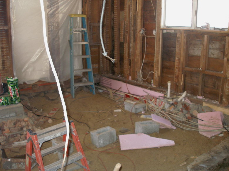
Kitchen Renovation {Demolition Phase}

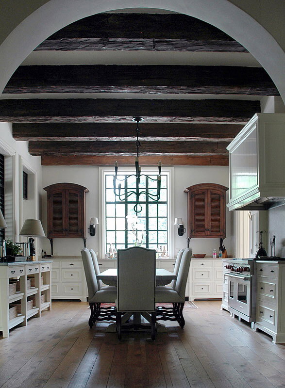
Kitchen Envy
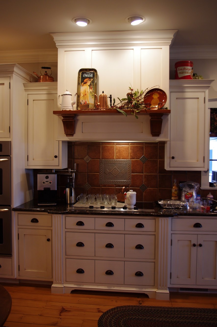
Kitchen Renovation {Putting it Back Together}

Welcome {to my New & Improved Entryway!}

Create Art from Anything {Nate Show Wall Panels}

DIY Herringbone "Tile" Floor Using Peel & Stick Vinyl {Knock It Off}

Best DIY Projects of 2012

Chevron

Michael Trapp is on the Move!

Crazy?!
