My Creative Blog [Search results for gray]
Creating with the Stars Round 3 Link Up Winner

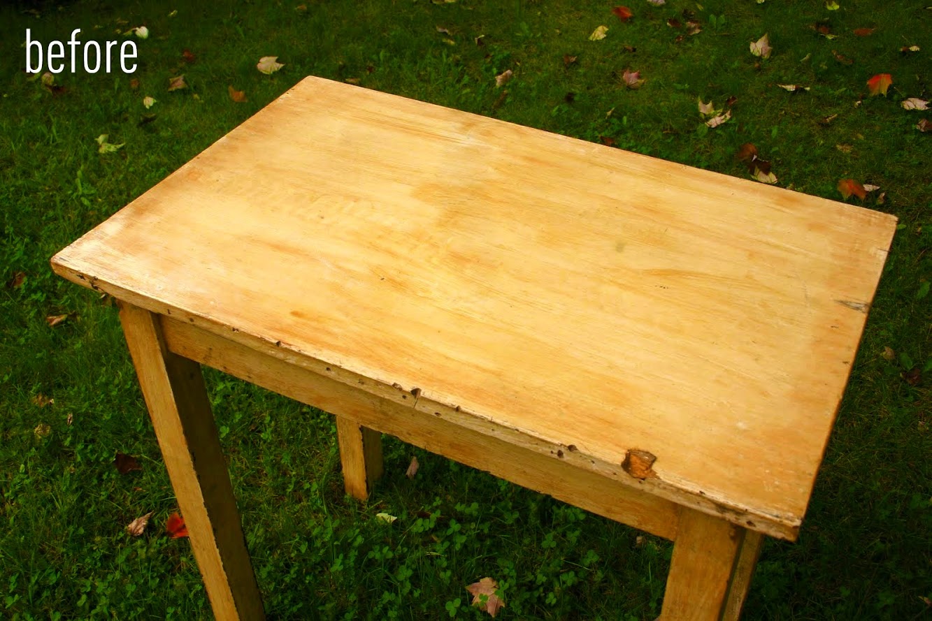
Antique Table Turned Vanity {Bathroom Redesign Update}
chelsea gray

gimme your grays...

Zinc: Irresistible Blue/Gray

The New Gray?

My Creative Blog

nate meets a perfect gray...
Orange, Gray & Mint Nursery Reveal

chelsea gray in the kitchen

Power-washing Saved My Deck's Life
Furniture is Here!

Shadow Painting...
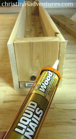
DIY Decorative Flower Trough {Christina's Adventures}
new grays from the September issues...

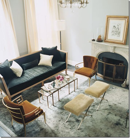
gray dining room mix

Orange Crush...

DIY Console Table {A Pottery Barn Knock Off}
Striped Hat Rack {DecoArt Glass Paint}

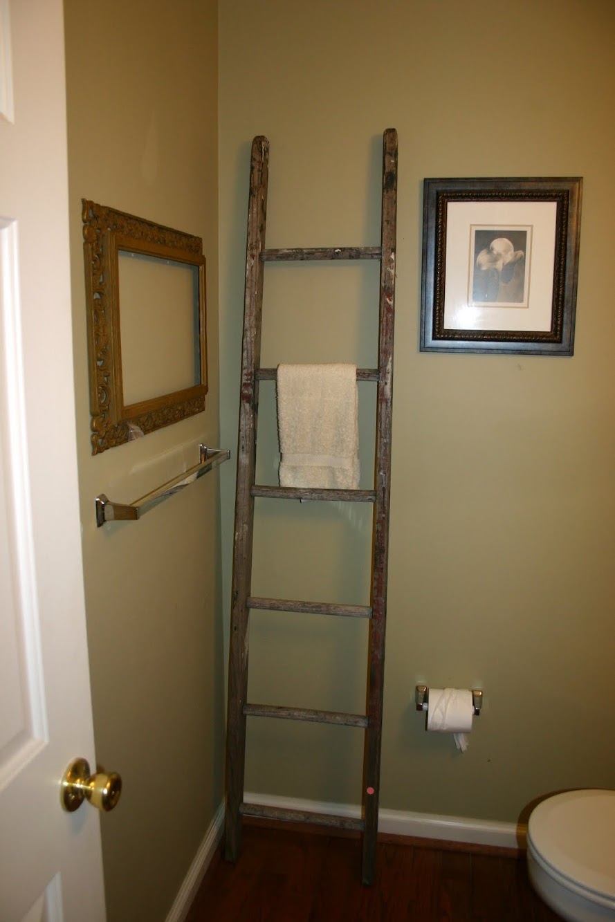
Moving Right Along {Bathroom Redesign}