My Creative Blog [Search results for family room]
Family Room Update {AKA What ever happened to those stenciled wall panels?}

Dreary to Cheery Family Room Makeover {Knock It Off}

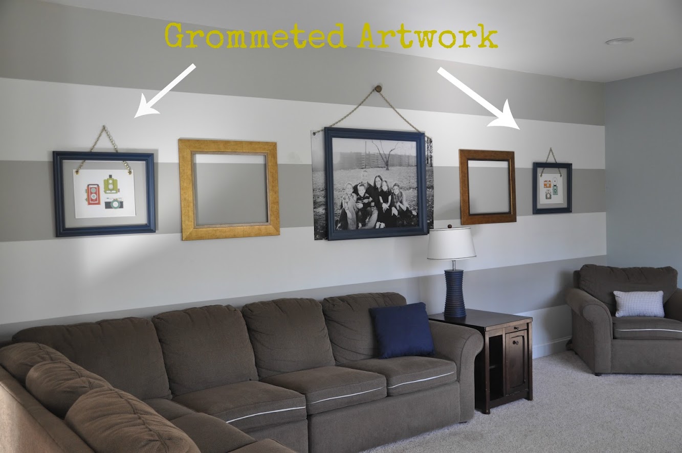
Family Room Art & How To Add Grommets!
FOR SALE!

Monica's Christmas House Tour 2012

Nate Berkus: Take Three

Summer Mantle {Playroom Edition}

SuperFab Room Redesign REVEAL {Guest Room}
Top 11 projects from 2011 {Monica's Recap}

Tips for Accessorizing your Space {SuperFab Room Redesign}

The Original Funkmaster… My DIY Dining Room and CWTS Updates!
Colorful Stenciled Accent Wall {Knock It Off}

The Evolving House {C1's Bedroom}

Fingerprint Artwork {Meaningful Art}

Ginormous Family Art {With an Industrial Flare}
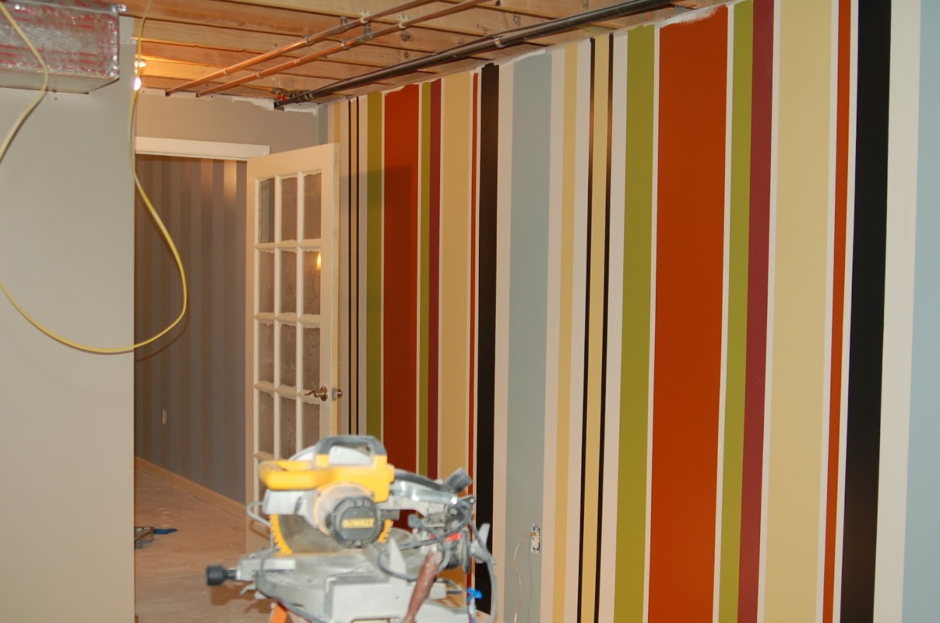
Journey to the Perfect Stripe
Fab Find Friday {Salvatori Photography}

Dining Room — After

DIY Marquee Sign {Knock It Off Project}

Jessica's Christmas House Tour 2012