My Creative Blog [Search results for Color

  • DIY Planters

    DIY Planters

    Have you ever noticed how incredibly expensive planters are? For about $40 I could get one itty bitty planter, that's not even cute. No thanks. I decided I would DIY planters that would work perfectly with my new painted door and rockin' house numbers. I didn't want anything to frilly, or girly. I wanted my style inside my house, reflected on the outside too! This project cost me $20 each, was incredibly simple, and totally fits my style.

    Color Block Planter

    Here's What you'll need to DIY your own color block, tiered planters: Plastic planters (mine were from Target) 2 colors of spray paint 1 color of latex paint Dirt, Mulch, Plants, Etc.
    I started with these plain Jane planters from Target (find them here). You can't really tell how big they are, but they're pretty big (I can't wrap my arms around the top of the large one- I tried, so that gives you an idea and a weird mental picture. Sorry about that!) They cost $7 for the medium and $13 for the extra large.

    DSC_0306

    The first step was to spray paint the middle color. I used Valspar's grey primer because I love the color.

    DSC_0310

    You don't need to worry about the top or bottom at all. Just get a nice, even coat on the middle. I did two light coats on mine.

    IMG_0657

    I painted the top color block with the same color I recently used on my front door. I'm a bit obsessed with it. I didn't need to tape for a clean line, because the planter had a lip that I was able to use as a guide. Also, make sure you paint down pretty far on the inside. I'm assuming your house guests will be taller than the planters, so they'll get a peek down inside.

    DSC_0327

    The next step, made this DIYer do the dance of joy (remember Perfect Strangers?) because it saved me so much time! I used a paint can opener to pop the bottom of the planters. I'll warn you, it will sound like you're breaking them, but you're not! They'll pop right back on when you're done painting them.

    DSC_0336

    Taking the bottom off, meant no need for tape or cutting in. Just spray paint the bottom whatever color you'd like. This was my little work station (aka messy garage).

    DSC_0340

    Put the pieces all together and you're left with cool, color block planters.

    DSC_0343

    They're nice like that, but I wanted to take it up a notch! I wanted some height, so I stacked them up. I didn't do any permanent attaching or anything, just fill the bottom with dirt, plant your flowers, add the next planter, and repeat.
    Again, remember the angle people will see them from when they walk in… mulch is a must. No one wants to see this…

    Boxwood Plants

    I used white wave petunias on the bottom and a boxwood on top.

    Tiered planter

    Here was my porch a few weeks ago. It was a sad situation… trust me, I know!

    Porch Before

    Take a look now! I think it's just a tad more welcoming don't you?

    Porch Update

    For a grand total of $40 and less than an hour, I got two color block, tiered planters that perfectly match my style and house colors. (You can see the door and house numbers Here) Now… if only I can keep the plants alive… What do you think of my DIY Planter Upcycle?

    **Since my mom loved my planters, she kind of hinted around to wanting one of her own. Here's what she got for Mother's Day! Black and Red to match her house!

    ----------------------------------------------------------------------------------------------------------

    Did you hear our BIG NEWS?

    Click here for our announcement post with all the fun details!! We can't wait for July 7th!!

    jess
    Monica
  • Making Design Easier {Design Seeds}

    Making Design Easier {Design Seeds}

    You all know it already, and I'm pretty open about sharing this one fact: I am not a designer by trade. I've never taken design classes, and in fact, often dreaded going to art classes in school. I'd call myself an amateur- I do what I like and think looks good in my home. Period. One of the things I find difficult (although, I admit it does get easier the more I do it) is choosing the right colors in my designs. I often have an idea or concept in mind, but getting there is tricky, especially for a non-detail-oriented person like me. Enter Design Seeds:

    Design Seeds solves the color dilemma for us by offering tons of color palettes based on things you see every day. Like the colors of Fall? You can find several different palettes incorporating the various colors found in Autumn. Isn't that amazing? If you've been on Pinterest at all, I'm sure you've seen some of these floating around:

    Source: design-seeds.com via Jessica on Pinterest
    Basically, Jessica, the genius behind Design Seeds forecasts emerging trends and comes up with relevant color palettes based on those. She also sells a bunch of books that I would personally love to have on my coffee table or to use as inspiration.
    Here are just a few of my favorites:

    Source: design-seeds.com via Jessica on Pinterest
    Wouldn't this be beautiful in a nursery for a baby girl? Love the muted purples.

    Source: design-seeds.com via Jessica on Pinterest

    Source: design-seeds.com via Jessica on Pinterest
    Can't help but fall head over heels for colors inspired by travel!

    Source: design-seeds.com via Jessica on Pinterest
    Oh man, this would be a super-fun palette for a summer birthday party, right?

    And just in case you were wondering, there is a general rule of thumb when it comes to using color in design:

    Use 60 percent of one color, which is your dominant color (think paint on the wall). This is the unifying color- most likely a neutral that ties it all together. Using 30 percent of your secondary color adds visual interest, like the furniture in the room, and then 10 percent is an accent color. Accessories, pillows, flowers etc. These are the things that make the room shine! Go ahead and take a look at your design inspiration pictures: most likely they are divided within this rule. Crazy, huh? These Design Seeds palettes provide a variety of colors that you can choose from for your home decor, wedding or party planning, and even when choosing an outfit!

    Don't you just love it when there are short-cuts for great design?; )

    jess
  • How to Paint a Mosaic Accent Wall {Bedroom Makeover}

    How to Paint a Mosaic Accent Wall {Bedroom Makeover}

    Yesterday, I shared my daughter Kira's Colorful Bedroom Makeover with all of you. Check it out here if you missed it. It's interesting when you're doing a room for a little person… there's this part of me that wants to go all crazy blogger-designer-nutso on the space, and then there's the realistic mom side that reminds me that her room will be a disaster of toys in about 3 minutes flat and that I don't need to go over the top to make her happy. Honestly, I'd kind of be going over the top just for my own self-interest. So, with that being said, the mommy voice won out and I went with a fun, yet practical room makeover. I'll guess I'll save up the glitz and glam for the master bedroom (if I ever do tackle it!).

    Today I'm going to share with you the focal point of the room… The Mosaic Accent Wall!

    I'm a total sucker for an accent wall. Honestly, since I was a junior in high school I've been whipping them up! My very first was a blue feather dusted wall in my parents' house. Then, I did a pretty cool square grid wall (again at the 'rents house) when I was a senior. Kenzie's first bedroom had vertical stripes and stars, then I changed to a fun magenta gingham. We had an argyle bedroom too! I wish I had pictures of all of those, but it was in the film day and age- boo! Enough of the trip down memory lane, let's get going with the tutorial! How to Create a Mosaic Accent Wall Since this is the room of my 5 year old, I asked her what she wanted, and she told me LOTS of colors."Mommy, I want purple, blue, green, orange…" and the list went on and on. I thought about it and finally decided, I could give Kira exactly what she asked for- lots of color!

    I bought a sample size of each color and a gallon of white paint to use as my base and for all the other walls. One word of caution, Valspar sample paints do not have the normal bonding agents that regular paint has. It will require more coats for solid coverage. Just keep that in mind when you're planning a project. For me, buying 8 quarts wasn't an option (this was a makeover on a budget) and I'd rather have to do a few extra coats of paint. I had JUST enough- it was close, but we stretched the samples far enough.

    This unfortunate event occurred as soon as we got home with the paint. Grrr… I was sort of hoping Hurricane Sandy would wash some of the stain away a few weeks ago- No.Such.Luck!
    Blogger Fail!

    Here's my supply list: Valspar® Sample Paints Base coat paint Purdy® Paint Brush Chalk-line (a DIYer Must Have!) Tape Measure Pencil Frog Tape® Mini Rollers Paint Trays

    I had to get rid of that BRIGHT aqua color and amazingly, the Valspar white paint & primer in one did the trick! I was left with a blank"canvas" and two weirdos (the hubs and my oldest)!

    There are all kinds of approaches to getting perfectly straight painted lines, but I really think we use the BEST method. I'll tell ya about it, and then you can be the judge…
    1- Measure out your stripes and put tick marks on both sides of the wall.

    2- Use a Chalk-line to get Perfect Guide Lines- Simply, put the string directly on the tick marks on both sides of the wall, pull the string taut, and snap that baby! It is so much MORE accurate and FASTER than using a level and a pencil. Let me remind you of something… you've seen how awkward I am at dancing… would you trust me to use a level on wall stripes? I think not.

    These bad boys are crisp, straight and ready for some Frog Tape!

    3- Use Frog Tape to Divide your Stripes. When I'm working on an accent wall, I know it's going to be the main focus of the room, so I have to have crisp, perfect lines (yes, perfectionist tendencies admitted).

    My hubs uses a few pieces per stripe, but I'm a one stripe wonder. I definitely prefer to do the entire stripe with one piece to make sure there aren't any uneven seams. Also, make sure you tape off the two side walls.

    I love me some stripes!

    After all my horizontal stripes were finished, I randomly placed my vertical dividers. I toyed with using a mini level to get them perfect, but then decided I could do it well enough by eye. Please ignore the epitome of frumpy DIY clothes, no shower, and tape on the leg.

    Whenever I'm working on a project like this I rip off a bunch of pieces the length I need and keep them on the wall so I can get to them quickly, if I'm not using that method, I keep the roll of tape on my arm. Works like a charm.

    4- Paint the Edge of your tape with your Base Color. It's one extra step, but it's the MAGIC INGREDIENT to perfect, crisp lines. Frog Tape alone is excellent, but on an accent wall like this, I had to be sure everything would be perfect. Just take your base coat color (whatever color is under the stripes) and with an semi-dry brush (not dry, but not sopping wet either) paint over every edge. I don't recommend using a roller for this step, I always use a paint brush.

    It makes the wall look a little scary, but it will all work out in the end! Allow it to dry- I gave it about 40 minutes before putting color over it.

    I had a tray and roller for each color. I wanted to work in a random pattern and that meant making decisions as I went along- no time for washing rollers and brushes.

    Finally, it was time to put some color on the walls!

    If you want a random look (like mine) I'd recommend working in one section at a time, mixing your colors as you go.

    Because of the sample paints, it took 3 coats per square. It was a tad scary at first, but by the second coat, I was confident the coverage would be good.

    Jimniy Cricket- Even before I removed the tape I knew I was in love!

    Now, for the Moment of Truth-Removing the tape…
    Once again Frog Tape & the Mangin Method = Perfection!
    Seriously, I do a cheesy dance (you can picture it) every time I remove tape from a project!
    I do recommend removing the tape as soon as you're done-I don't wait for the paint to dry, and I remove it VERY slowly and evenly.

    Here's the finished product!
    It was so simple and took me and Eric about 4 hours from start to finish.

    Here's a before and after…

    It's a lot of color (as requested by Kira), but I like the extreme contrast that the white walls bring. I also could totally picture doing this with muted tones or even all in one color with an ombre effect!

    Almost every morning, I find KJ hunkered down reading books in her PJs… She loves her new room!

    Tomorrow, I'll be giving you all the details on the whiteboard wall and Wednesday one of our favorite things… DIY faux canvases with Staples prints! Make sure you check it out!
    What do you think of the accent wall? Have you ever tried something bold with paint?

  • Landscape Design by Candice Price Garden Design

    Landscape Design by Candice Price Garden Design

    Candice Price Garden Design Landscaping Description for Monica

    “I began with Monica’s bright bold design flavor and her newly painted chartreuse green door. I started by finding some plants that would complement that color and then some that would contrast nicely with it. I chose the cherry trees for the spring color and the dark purple bark; the red buds for the spring blooms and the deep purple leaves all season.

    I suggested placing some of the amazing rocks found on her property in a couple of anchoring positions and softening them with the Hinoki Cypress which bring in that chartreuse color as well as the golden thread Cypress.
    I chose the the hydrangea paniculata for their bold color that lasts a long time and to add a soft feminine feel in between the evergreens. The dark green shiny leaves of the Cherry Laurel (evergreen) is also a nice splash of bling and contrast. The Cherry Laurel is near the porch and walkways because of its incredible smell early in the season. I also tried to pick a “foundation” of plants with lots of color not only during the growing season, but also throughout the winter; the cypress, the cherry laurel, the abelia, and junipers are all evergreen.
    The smoke bush is also a favorite of mine and I thought would be an incredible pop of color to contrast the yellow greens. The choices I’ve made also have layered rhythms of heights that create a mystery and intrigue as you travel on the walkways. The Smoke bush is a large bush but not as large as the trees. The trees however are perfect for the front yard because they are small trees and won’t overpower the shape, size and frame of the house.
    The Abelias and Junipers are both evergreen shrubs but they would be considered ground cover. The Abelia will only get 2’ tall and spread out to 3’ and the junipers (notice the blue color that will go really well with the yellows and the purples) will only get about 8-12” tall and spread to 18” or so.
    This is a nice foundation that spreads out and creates a garden area but leaves ample room for perennials and annuals along the edges of the walkways and around the porch. I also suggest a couple foliage perennials: Black Mondo Grass and The Heuchera Obsidian. These would be gorgeous bold accents all season in between your plants. I would suggest any annuals that are in the blue, purple, pink, yellow, orange, or chartreuse color families would just make this incredible! “

  • Finding Treasures {Flea Market Hunt}

    Finding Treasures {Flea Market Hunt}

    Monica and I both went to the Dublin Fire Co. annual flea market last week (went the same day, but not together. Boo!) This was the first flea market I had been to where I was actually looking for items to repurpose. I had a couple of things in mind that I wanted, but also found a few other things that just begged to come home with me. I went with my mom, and she is a great person to go with because she, like me, can see potential in anything! (It's one of the perks of being an eternal optimist).

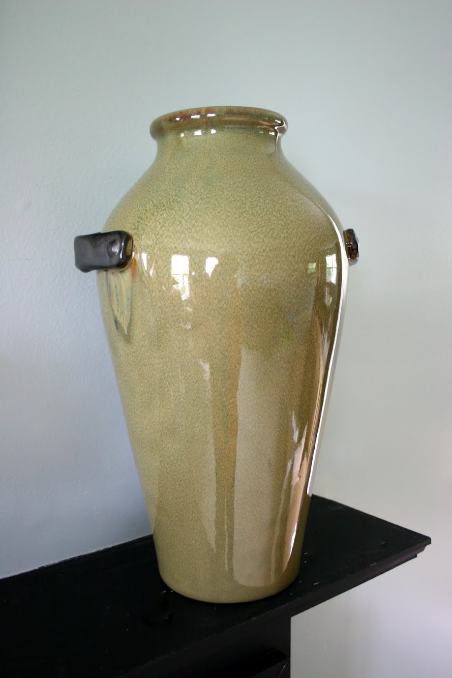
    I got this awesome Pier 1 vase/urn for $5 (regularly $30) and it now graces my mantel.

    One of the other things I purchased was an old workbench/sawhorse thingy. This was a little bit of a risk for me- I had an idea of where I would put it, but wasn't sure it would work out. But for $20, I knew I could use it somewhere!

    That little beauty fit perfectly in my entryway! I had been wanting something to make that space a little more welcoming (and I little less"go away"-like, as Monica says), and this fit the bill. I can't get enough of the color, either.

    Good, sturdy legs, huh?

    This large pitcher caught my eye on the first table I went to. It was very country-looking with it's red and white checker pattern (sorry, no before pictures, but trust me, it's much better this way), but a little Rustoleum Painter's Touch spray paint in glossy white took care of that. I filled it with pussy willows from a local garden center and now it looks like it was meant to sit on that bench all along, and I just led it home.

    Over on the other side I stacked a few books and an old lantern of my grandmothers. I love having a few of her things in my home as a way to remember her. That cute little plant is from Ikea and the mug was from a friend. (Thanks, Lindsey S. It's getting good use!)

    (The view from the hallway upstairs.) On a side note, the pictures have made me hate the color of paint on our walls in the entry even more than I already did. When we moved into this house, the walls were peach. Like literally peach. We said goodbye to those as soon as we could, but lo and behold, the color I picked to replace it has a pink undertone, as well. Definitely the color of swine. (Melissa, at the Inspired Room, dealt with an entire house of swine, and I realized that this is the PERFECT description of my color). Blech! It will be a nice, non-swine, beige soon. Add that to the never-ending to-do list for my hubs. Poor guy.

    Some of you may be wondering about the frame hanging above the new bench vignette. My hubs and I made this out of reclaimed barn wood (my father-in-law has a treasure trove of barn wood in his barn. Go figure.: ) Kevin cut the picture holes (is that the right word?) and then mounted another board to the back that I painted black, so that I could attach the pictures to it. I then painted the entire frame black, then painted it again in a brick red color with a thick bristle brush and minimal paint so that it looked a bit distressed. Finally, I added the phrase that I bought from Uppercase Living to it. I am so in love with this frame, it's not even funny.

    Speaking of reclaimed barn wood, I have two big pieces ready to be made into frames (one holds four pictures, and the other holds one picture). If you're interested in purchasing one, send me an email to let me know. You can totally customize the color and phrase. This piece never fails to get lots of"wows", so if you want one in your home, give a holla!

    What are some of your favorite flea market treasures?
    Happy Monday,

  • Journey to the Perfect Stripe

    Journey to the Perfect Stripe

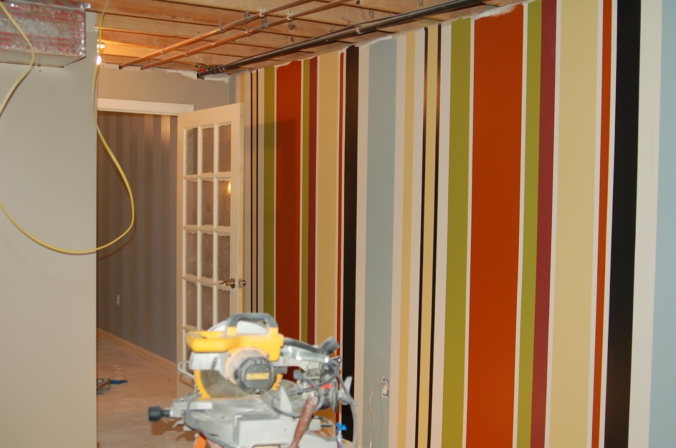
    My house has never been without some kind of stripes… EVER. I guess I just love 'em… Back at our old house I actually used all the old paint samples and leftover colors to do a crazy, random stripe wall in my basement office. This picture was before the ceiling went in, but in the end, it was pretty crazy and cool.

    We've also done stripes in the same color, with different finishes. This was flat enamel with eggshell.

    So, since we're in a new house… we needed some stripes… I was feeling lost without them!
    Family Room Stripes

    .
    Since we've done stripes many, many times we've learned a few things along the way. Nothing is more frustrating than crooked stripes or bleeding lines. I've told you over and over that I can fall into the perfectionist category… bleeding stripes are NOT COOL in the Mangin house. How to Paint 99 percent Perfect Stripes (It's 99% because I thought Perfect sounded a little cocky!) 1. This step is optional, but I highly recommend it… find a handsome helper. It definitely is a 2 person job. 2. Determine the width of your stripes. For the family room I wanted BIG wide ones, so I did 18 inches 3. On both the left and right side of the wall, use a pencil to mark where your stripes will end. Just a little line will do. 4. Get a chalkline. It's the best thing ever for stripes. Just shake, pull tight, snap, and voila! Perfect guide to tape by.

    Eric just loves when I'm supposed to be holding a chalkline nice and tightly and I have a camera in my hand at the same time!

    5. I'm the taper in the family. I will ONLY use Scotch blue tape. Eric like the blue tape with the orange inside because it's extra delicate, but I like blue with the blue inside.

    The key to taping is just making sure the edge of the tape is in a smooth line and not jagged where your pieces start and stop. I also take a credit card or wooden spoon over the tape when I'm done to seal it.

    6. This is the magic step people… Take the current wall color paint (the color that your new stripe will touch, not the color of the new stripe) and paint along the edges of your new taped space. This will ensure that if your paint bleeds (which it will at least a bit no matter what you do) that you won't see it because it's the same color at the wall! It works like a charm!

    You can see a difference in the color, but that's because it was still drying. I'll also add that we just let it dry for like 15 minutes, because it's a nice, thin coat.

    I've also heard of this technique using ModPodge if you don't have leftover paint, but I can't say I've ever tried it. Let me know if you have and how it turned out! 7. Roll your main color… this one needs no explanation

    8. Remove the tape. We always remove the tape before the paint dries. We wait just long enough to be sure we're done and don't need another coat of paint, then we take it down. My technique is slow and steady and at a slight angle.

    If you've done step #6 you're guaranteed crisp lines, so this is no longer a stressful"I wonder how it's going to look" moment!

    Once the wall is totally dry you might need to take a damp cloth to get some leftover blue chalk off, but otherwise, you're done!
    Overall, I'm really in love with my new stripes!

    But … I'm not so in love with the artwork anymore! I can feel my husband rolling his eyes when he reads this post. I like the shape, but they just don't work anymore… and honestly, I'm not sure I ever LOVED them (and yes, I only bought them 6 months ago!)

    The next part of this room re-do is to stripe curtain panels for the opposite wall. I'm excited to try this after my vacation next week!

    So, are you a lover of stripes like I am? Have you conquered the perfect stripe?

    Linking up to: TatorTots and Jello

  • Ombre Painted Dresser {Knock It Off DIY Project}

    Ombre Painted Dresser {Knock It Off DIY Project}

    Got an old dresser that needs some love and attention? Don’t kick it to the curb just yet! Try out this ombre paint method for a fun, modern design that will give your dresser new life!

    *Insider tip: When we're looking for furniture to upcycle, we make sure that the piece is in relatively good condition. That doesn't mean it looks good, just that it's structurally sound. Ideally, we love a piece with clean lines and a classic style, but don't overlook a piece just because it has scroll-work or is ornate. Oftentimes, those things can be removed easily with a jigsaw.
    1. Prep the dresser by giving it a thorough sanding with an orbital sander to get rid of the old finish. Remove any hardware from the drawers for easy painting,, too! After sanding, wipe down the dresser with a damp cloth.

    2. Choose your color and get to work! You can actually achieve the ombre effect two different ways- by buying three or four colors from the same paint swatch, or, if you’re trying to save money like we were, using one paint color and changing the color with white paint! We’ll explain this method, since it’s the one we used. Don’t worry, it’s not hard and it’s worth the little bit of extra work!

    3. Go ahead and paint the bottom row of drawers using a small foam roller (designed for painting furniture) with the undiluted, fully-saturated color. The key to a nice finish is even long, even strokes and several light coats of paint. Set drawers aside.

    4. To thin out your paint for the next color, pour three parts of the original paint color in a small paint tray and add one part white paint (3:1 ratio). Roll onto next row of drawers.

    5. Using the same method, thin out the paint with a 2:2 ratio for the third row up from bottom and a 1:3 ratio for the top row of drawers. Paint and let dry the specified amount of time. 6. Add new hardware- we chose to bling out our dresser with clear, glass and gold knobs for this adorable little girl. Or, put the old hardware back on to save even more money!

    Voila! You’ve easily accomplished the fabulous and trendy ombre effect on your dresser! This style is awesome for a nursery, but depending on the colors you choose, could really be used anywhere in your house!

    We've tried our hand at lots of different dresser upcycles. Our absolute favorite is this Anthropologie- inspired dresser

    But, we also kind of love this outdoor furniture upcycle:

    So, please…for our sake…don't throw out your old furniture! Do something fun with it.: ) To watch the full episode of this nursery makeover, click Here! There were so many fun projects in this room!

    jess
    Monica
  • Ombre Door {Keepin’ it Real}

    Ombre Door {Keepin’ it Real}

    We share a lot of projects here on our blog. We've showed you all kinds of DIYs we've tried and loved! Today is NOT going to be one of those days… I'm going to keep things real, and show you a complete and utter Epic Fail. Ready?? Just remember, don't try this at home.

    Ombre Door Disaster So ombre everything entered the scene in 2011 and it looks like it's sticking around for most of 2012. I love this ombre hair (and if my blonde roots keep growing in, it will look like I'm heading in that direction)

    Oh how I want this hair!!

    I also love these ombre striped curtains.

    Source: remodelaholic.com via Brandy on Pinterest
    So, when I was thinking about what color to pain the interior of my foyer door I started thinking maybe I'd do something a tad"out there" and go with ombre! I found these four colors and thought they would be awesome to create the unique look I was going for!

    IMG_0812

    I bought a sample of each color at Lowes. These colors make me so ready for summer!

    IMG_0806

    See my blah foyer door? (The grainy pics make it look even bleaker than it really is.)

    IMG_0795

    I also have plans to add some graphic art above the door, that's a DIY for another time!

    IMG_0793

    In my mind, this project seemed really simple, so I grabbed my trusty helper and got measuring. I made each section increase in size.

    IMG_0802

    I was just using the tape to give me a line to mark a pencil guideline and then I removed it.

    IMG_0803

    Here's where it all started going downhill… I painted the lightest color first and then went to the next darkest tone.

    DSC_0045

    These two colors blended fairly well, so it was onto the next color. Then came my dilemma… how to blend the remaining colors. I could have left them with a clean line, but that would have been more like color-blocking than ombre.

    DSC_0058

    I tried using a wet brush, a dry brush, sponges… I tried it all. Epic Fail.

    DSC_0063

    Look at that hideously awful, splotchy door! HA! It's really, really terrible isn't it? The hubs said we could add a wooden seagull cutout and it would look like it came right out of a cheesy seafood joint.

    Ombre Door

    Here are my lessons learned (So that you don't have to make my mistakes): 1- Don't try decorative painting on a door with indents and grooves. It's nearly impossible to make things perfect. 2- When going for an ombre effect, get ONE color and then achieve your gradations by adding white paint. That way you won't have 4 very different colors that you're trying to blend. (This was my biggest mistake, and I should have known better!) 3- Don't be afraid to try. Although this project might have driven me a wee bit crazy, it took all of an hour or so and hey, now I can at least say I tried an ombre door once!

    DSC_0078

    So there you have it… we might have been given the title,"Nate's Favorite DIYers," but we still have a major flop once in a while. I plan to paint my door solid yellow in the next few days, but until then we'll keep pretending we live at Larry's Crab Shack!
    Have you ever had a major DIY fail? Do tell! It will make me feel better about the great ombre disaster!

    Monica

    Only following on the blog? You're missing out. Use the buttons below to join in on all the fun!

    Follow Me on Pinterest
  • Slow & Steady {Bathroom Update}

    Slow & Steady {Bathroom Update}

    We've been making some slow and steady progress on our hallway bathroom redesign (see my game plan here), but it feels like the eternal job. This is because of two things: we're making sure all the funds are in place (even though this is a small job, we still want to be smart with our money), and I've been searching for all the right pieces. Here's what we started with:

    Not the worst bathroom you've ever seen, but it definitely had lots of room to improve. I'm so excited about this bathroom because it will be the very first room in our house that will be completed in the coastal/cottagey (neutral colors, weathered materials and warm wood tones) direction I'm heading in. I finally feel like I know what my style is, and now am taking baby steps to get my house in line. We started by breaking down the process into steps:
    Step One: Prep the Area First off, we had to take down that plain jane mirror and remove the builder grade vanity.

    My he-man hubs cut through the caulk around the countertop with a razor and after that, just lifted it right off.

    Removing the behomoth vanity came next. This was a bit tricky because we didn't have a clue how to didn't want to turn the water off completely to the entire house (he turned the water off locally, of course, though). After a bit of debating, Kevin decided to cut a small hole around the pipes with a jigsaw so that we could lift the vanity up and over the pipes.

    Can you even believe the color of the walls behind the mirror? When we moved into this house 4 years ago, this was one of the first rooms we painted. The color was just unsettling. Still is, as a matter of fact.

    Uh-oh. This was so not a happy moment. Actually, as we were pulling the vanity out, I said to the hubs,"I really hope the wood floor continues to the wall under the vanity." Ugh. It did not, and so, this project just got a little trickier.

    Thankfully, the previous homeowners kept a few extra planks of wood flooring, but no matter what we do, there's going to be a difference in the staggered pattern of the floor where the vanity used to be. It's a good thing I don't care about everything being perfect. Why sweat the small stuff, you know? The final part of the prep stage was spackling and sanding the walls, and applying the base coat of paint to the walls (Olympic Quill color-matched in Valspar Premium from Lowes- A warm neutral gray.)
    Step Two: Beef up the Moulding  This is a very simple and inexpensive designers trick that makes a world of difference. Some homeowners (ahem! Monica) are fortunate enough to have chunky baseboard trim, which just has a high-end, finished look, but we are not so fortunate. So, why not fake it? We bought 32 feet of half-round trim- enough to go around the entire bathroom, plus a little in case we made any mistakes. Then we took a piece of wood we had laying around to use as a guide (this is a must! It makes the whole job sooooo much easier).

    Our piece of wood was roughly 3.5 inches tall. Cut the half-round so that it has nice corners that will match up using a mitre saw.(You can find loads of tutorials online that will teach you how to use a mitre saw and make the right cuts.) Place the wood on the top of the existing baseboard trim, lay the new cut half-round trim on top of that, level and then shoot in a few nails using a nail gun.

    Next, use paintable caulk to fill in any gaps, and wood filler to fill in the nail holes. Finish with primer (ok, we did not do this because we NEVER prime, but you should do as I say, not as I do. We are such rebels.: ), and a fresh coat of white trim paint.

    Voila! Chunky and fabulous.
    Step 3: Paint Stripes I'm not going to go into detail about this step, because we followed the exact instructions for painting the perfect stripe. I decided that we would paint a total of 3 stripes, and the middle stripe would be the darker color (Olympic Stormy Weather, color-matched in Valspar Premium)

    The perfect stripe method worked perfectly! No bleeding at all. This picture does not do either color justice. They both lean towards gray, but are still warm like a neutral tan. I'm seriously in love with both of them, and am now contemplating painting the hallway/foyer one of these colors as well.
    Step 4: Make a Huge Mess (Optional)  This is what our hallway currently looks like. How long can one live like this and not go crazy? We are are trying to figure out the answer and will fill you in. You're welcome.

    Step 5: Install New Lighting 
    Yup, after all the votes were tallied, I decided to go with this large, bronze fixture for above the sink.

    It's awesome and huge, but there's just one problem: Because it's an outdoor light, the recommended max wattage is 60W. That makes for a very dim bathroom. I'm not giving up on this light, though, because I'm basically already married to it. I'm toying around with adding additional lighting somewhere else, and switching out the bulb to a 75W bulb (I'm a rebel, remember?)

    See how there's almost no light shining above the fixture? Any suggestions?
    Here it is, as it stands today:

    Lovely beefed-up trim.

    Gorgeous stripes in neutral colors. I just had to throw my old ladder in there because I'm so impatient. And guess what? It's a keeper.

    Wheeee! I'm totally loving it so far.

    To Do List: 1. Add crown moulding. We're holding off on this until we can get a friend to help since we've never done it before and we've heard it's pretty scary.
    2. Fix the flooring under the vanity and install baseboard in that area.
    3. Paint and apply an antique glaze to the mirror.
    4. Figure out the vanity situation.
    5. Accessorize! (My favorite part!)

    So, it's slow and steady progress, but it's progress nonetheless!
    Happy Thursday,

    -------------------------------------------------------------------------------------------------------------
    A big welcome to our newest sponsor, Dream Dinners in Colmar! If you don't know about Dream Dinners, your life is about to get a whole lot better. Save 10% on your first order, when you use the code DDNC201110. Head on over and check it out!
    -------------------------------------------------------------------------------------------------------------

  • Creating with the Stars Round 4 Voting {The Final Round!}

    Creating with the Stars Round 4 Voting {The Final Round!}

    If you missed all the amazing projects in the first three weeks of CWTS, be sure to check them out below!
    Round 1 Projects & Winners Round 2 Projects & Winners Ro und 3 Projects & Winners

    We want to thank HomeGoods and Homes.com for partnering with us for this competition. They believed in this contest from the start and I'm positive the contestants have knocked their socks off! Since this is the Final Round, and we'll be crowning a CWTS 2013 Champion, we needed an awesome Grand Prize Package! The Grand Prize Winners -Contestant and Blog Star- will EACH receive:
    $500 from Homes.Com $500 Gift Card to HomeGoods
    Project featured by HomeTalk

    undefined

    Also, for this round, HomeGoods provided each contestant a $100 HomeGood's gift card! Jess and I adore HomeGoods and just last week we picked up about 8 rolls of the best wrapping paper ever! You never know what awesomeness you'll score!

    ---------------------------------------------------------------------------------------------------------
    Okay, now let's get to business! There are only 3 projects this week, so you're voting for your 1 and only favorite! We're so proud of each of these ladies and we know they've worked crazy hard the past month! As you're voting and commenting, please keep things positive & encouraging and just pick your favorite project. We've tried to keep things as anonymous as possible, so don't bother playing Sherlock Holmes.: )
    Without further ado, We present to you… The Round 4- Grand Prize Projects

    #1- Guest Room Makeover
    For my final CWTS project, I chose to makeover a guest bedroom. I envisioned a guest room that was full of personality…fun pops of color and an interesting mix of textures and objects that feels comfortable, unique and welcoming to guests.

    What do you make with an old fireplace mantel and a shower curtain? Create a headboard of course!
    I loved the gorgeous detail in the border of the dark wood, in addition to the design of the shelf with the mirror and paneling. To complete the transformation to a headboard, I closed in the fireplace opening with plywood. and then I upholstered it with the blue and green ikat fabric---A.K.A a shower curtain from Target!

    After I spent about an eternity installing bead board and chair rail, I felt like the room needed a really fun pop of color that would also work well with the headboard fabric. For balance, I purchased a white round side table at HomeGoods, and painted it with some fabulous emerald paint!
    In selecting bedding, I chose to go with a crisp white duvet cover, so as not to overshadow the headboard fabric and pillows. Picking out pillows was super-fun and HomeGoods never lets me down when I am in need of a"new pillow fix." I fell in love with the vintage camera pillow (also from Home Goods) and felt it added an interesting and unique element to the room. The blue lamps added another great pop of color. My goal was to incorporate interesting objects with a mix of coordinating colors and textures into the room…the collage below shows all the details that I hope will make overnight guests feel cozy, comfortable and inspired.

    Homegoods was the perfect sponsor for the home decor round. HomeGoods is one of those stores where you may go in with the intention"just to browse"…but never leave without something"you just had to have!"

    #2- Colorful, Texture-filled Bedroom Makeover
    The home decor challenge gave me the perfect opportunity to complete some of the projects I have wanted to try for a long time! Starting with a bare white room, I couldn't wait to add some color, pattern and texture

    . To frame the bed, I created an accent wall covered with grasscloth wallpaper and used trim to frame the bed and nightstands. I love the touch of glamor that the nailhead adds to the space. While installing the nailhead, I tried a few new techniques that made it go surprisingly fast! Best of all, this wall is completely removable, renter or indecisive designer approved!
    I added a few accessories from Homegoods. And customized a few pillows using scarves, napkins and paint.

    I constructed the headboard from lumber and cut the detail in the arms with a jig saw. I then upholstered it with foam and a bright coral fabric. I love the simplicity of the headboard, but the curved detail and bright coral color make it extra special!

    I love the subtle texture of the grasscloth, and how the nailhead adds a little extra detail.
    I hope you enjoy this colorful, energetic transformation!

    #3- Reading Room Makeover
    When it was time for the Home Decor round, I waffled back and forth on what to do until I remembered that I had this nice (relatively) empty room in my house just waiting to be turned into something fun. After playing around with a few ideas, I decided I wanted a place to relax, read, and spend a little quality alone time…and the next thing I knew, the reading room was created.

    I took regular ol' Ikea Billy bookcases and turned them into built-ins (thanks to some crown molding and a little DIY magic) and amped up the room a bit with trim and some paint in a traditional"library"-ish color. To make it more modern, I painted the back of the bookcases with some chunky gold stripes and tossed in a cozy chair and pouf, a DIY-ed tree stump table, and a ton of bright and colorful accessories.

    When I was shopping for the room, one of the first places I wanted to hit up was HomeGoods — I'm obsessed with basically everything they carry and knew their store would be perfect for our bookcases. I managed to snag that gorgeous throw pillow for the chair, as well as several of the cute accessories you can see on the bookcases (including my personal favorite, the blue elephant up at the top)!

    I'm so excited to have this space now, and I can't wait to settle in and start reading!

    Now, it's time to Vote!

    You can only vote once and only for one project. (the past weeks you could change your vote if you wanted. You might have thought you could cast multiple votes, but nope- it was just changing your vote- it was set to just one per IP. This week we didn't allow vote changes, so make sure you have your mind made up when you vote! Good Luck- it's a tough choice!!) In order to vote, you must first LIKE EC2 on Facebook.

    jess
    Monica
  • Pantone Color of the Year 2012

    Pantone Color of the Year 2012

    Do you know what Pantone is? No, it's not a well-known shampoo. Pantone is the a leading authority on color and inspires fashion, home design, make up and graphic art trends. But we all know that what all I really care about is how Pantone impacts home design. This year, Pantone chose Tangering Tango as the color of the year, and this is why: “Sophisticated but at the same time dramatic and seductive, Tangerine Tango is an orange with a lot of depth to it,” said Leatrice Eiseman, executive director of the Pantone Color Institute®. “Reminiscent of the radiant shadings of a sunset, Tangerine Tango marries the vivaciousness and adrenaline rush of red with the friendliness and warmth of yellow, to form a high-visibility, magnetic hue that emanates heat and energy.”
    I'm really digging this color, as you may remember my recent admission of a design crush, and think it is a super fun way to brighten up your homes. Let's take a look, shall we?

    Source: blog.hgtv.com via Jessica on Pinterest
    I love that coral artwork, and look! It's paired with blue.: )

    Source: hgtv.com via Jessica on Pinterest
    Such a cute headboard!

    Source: paloma81.blogspot.com via Jessica on Pinterest

    How about a statement furniture piece?

    Source: lonnymag.com via Jessica on Pinterest

    Source: shelterness.com via Jessica on Pinterest I'm not a huge fan of this room, but I do like the pops of orange on the pillows and the chair. That chair has gorgeous lines. Just sayin'.

    .
    Source: redoitdesign.wordpress.com via Jessica on Pinterest There is so much to adore in this room, but did you notice the base of that lamp? Oh, it's just too much!

    Source: mydreamtolife.blogspot.com via Jessica on Pinterest Another fun idea is to use tangerine tango in your party decor. It would work so beautifully in Spring, Summer and Fall!

    Source: etsy.com via Jessica on Pinterest Using this fabric on pillows would be fabulous!

    Source: etsy.com via Jessica on Pinterest I can't get enough of this print, and might just have to incorporate somehow into my life. Not only is it cute, but isn't it so true??!
    So, are you ready to Tango?

    jess
  • The Living Room: Before and After

    The Living Room: Before and After

    Just to review....this is how we found it.

    The single-paned window, and perhaps even the deck, were most likely added sometime in the 80's. When the contractors put in the new Marvin window, they had to tear down the deck in order to put in both the headers and footers. We'll rebuild something more period looking to the house — a balcony with a wide center staircase going down the middle and into the back yard.

    This is the opposite wall. See all that brown trim? That's all covered in faux wood tack paper to assimilate wood trim. It was horrible to remove.

    This room has evolved over the three years we've owned our house (we once had our bed in here). It was the very first room we tackled when we bought the place (the picture of Hubby was within hours of taking ownership) and so it was the first room we finished in terms of the bare bones part. The actual decorating would come much later, as in now....and it's quite serendipitous as again, we're 'moving' into this room just before Christmas.

    Here's sort of another 'before' picture that shows our previous color scheme, dictated primarily by the furniture and rug we had on hand at the time.
    And here are the 'afters.' I took these pictures on the darkest days of the year as we're having lots of fog and rain — hope they turned out alright!

    As you can see, I painted the room white. It's Simply White by Benjamin Moore (Eco-Spec line), which is the same color we've used on all of our house trim and many of our walls. The old color just felt too ruddy looking and I realized (no agonized over) that I'm most drawn to that classic white wall farmhouse look where the color of the walls isn't what the room is about.
    I wanted the room to be more about the fireplace, the windows, the view, the light coming in, the furniture, and the artwork. And I just thought that white allowed these things to shine more than any other color. Also, Janet (hi Janet!) over at The Gardener's Cottage just painted her living room Simply White and it completely inspired me!

    The mirror over the mantle is such a better fit than our other one. I found this several weeks ago at an antique store for $120.

    I picked up the brass sconces at an antique store for $20 each. I had been looking for some sconces online but found them to be very expensive. So these were in our price range and I've always loved the look of a pair of sconces over a mantle.

    The seagrass rug is a 9x12 (it hasn't quite flattened out yet after being rolled) and will be relocated to the dining room once I decide what size seagrass rug I want for this room. I know it will be several feet bigger but still trying to figure out exact dimensions before I order it (the first one I ordered had a mid-January delivery date so I cancelled it).

    The furniture is by a company called Rowe Furniture. We knew we'd choose something from their line because they are committed to natural fiber fabrics, eco cushion cores and wood from replenished forests. They are also members of the Sustainable Furniture Council (SFC).
    This was all very important to us as we have made great efforts to make our home as green and healthy as possible. We also liked the price — due to a special sale that they were having at the time, the couch was just $1,099 and the chairs were $599 each (and we chose the highest grade fabrics).

    The velvet couch is extremely luxurious. We love the high curved arms (much like a sleigh bed) as it provides the perfect support for reading a book, sipping a cup of tea or snuggling up next to the warm fire — especially on days like today.
    I picked up the brass easel a few years ago for $40 — a price I just couldn't pass up. The antique frame was my Great Great Grandfather's and I'm in the process of ordering a beautiful print for it. I can't wait as I've always loved the artist and will be absolutely delighted to have a piece of hers in our home.
    The cabinet used to be in the dining room. It got bumped from there because there will be two new windows going in this spring/summer leaving no room for it. It's sad but I absolutely love it in the living room. It's gone from dining cabinet to secretary, a look I have always loved.
    I also like the height it provides and think it really adds a nice finishing touch to the room. We found this piece at a local antique store that used to get antique furniture shipments in from England. During my semester abroad in college, I lived in England and would spend hours going through all of the gorgeous antique stores looking at beautiful cabinets very similar to ours. So it's sort of serendipitous that this piece found me after all of these years.

    The cabinet came with black oriental pulls on the drawers, which I don't believe were original due to the lovely brass button knobs on all of the cabinet doors. So I switched them out for Eastlake pulls which offer it more of a country look (and of course, I absolutely love all things Eastlake).

    So there it is! I'm sure it will continue to evolve as all rooms do! I hope you like it! We just got our Christmas tree today so we'll be putting that up tomorrow night....so more photos to follow!
    Photo updates:

  • Stencil Happiness {Royal Design Studio}

    Stencil Happiness {Royal Design Studio}

    Remember my kitchen before?

    Ouch. That actually makes my eyes hurt a little bit. Now I know that I am so blessed to have a home with a fully-functioning kitchen, so I shouldn't complain too much, but now that we've made some progress in our remodel I can't imagine going back to that.

    This is the corner of the kitchen that is getting the biggest transformation. We already knocked out the wall, and took down the cabinets. Then after repairing the half-wall and drywalling, we got down to the fun stuff: painting and stenciling. What? That's not fun for you? You're crazy.: )

    The new paint color for the kitchen is the same color we used in one of the stripes in our bathroom makeover — it's Olympic Stormy Weather color-matched in Valspar Premium at Lowes. It's such a pretty color and is so calming. Actually, the other day after we had painted the kitchen, my hubs said,"Our home is starting to feel so calm". Honestly, I wanted to jump for joy and give him a big fat kiss, because that's exactly what I'm going for! I married a good man.

    As part of our prize for winning Crafting with the Stars, we each received a stencil from Royal Design Studio. I know, right? So fun! As soon as I picked out my stencil (Large Fabric Damask), I knew what I wanted to do with it. My plan was to hang open shelves on one wall in our kitchen, but I though that an all-over stencil would add so much interest to the wall, and make it go from plain to amazing.

    Royal Design Studio offers a whole tutorial on their website, which I actually read thoroughly. I'm usually a"let's give it a go, how hard could it be?" kind of girl, but stenciling was new territory for me and I really didn't want to have to explain to my husband why we needed to repaint the wall if I did it incorrectly. I started out by figuring out the layout. This is one BIG stencil, and it worked out perfectly to do three of each pattern across the wall.

    Source: royaldesignstudio.com via Jessica on Pinterest
    I started on the far left wall and lined up the very edge of the stencil with the end of the wall, so some of the stencil plastic hung off the wall.

    Is that gold paint scaring you a bit? Ha! Don't worry, we used this same stencil with gold paint in our most recent Nate Show project (which we can't wait to share with you!). The color I used for my kitchen was one shade lighter than the Stormy Weather- I don't know the name anymore, but if you get the paint chip for stormy weather, it's on there!

    Here's what I learned while stenciling: 1. Stenciling is not for the faint of heart! It's very time-consuming and repetitive: each stencil took me about 25-30 minutes to do. 2. To get clean, crisp lines with no drips, use an extremely dry brush. I poured the paint onto a paper plate, dipped the brush, and then dabbed the brush on paper towels until there was almost nothing left on brush. 3. Use a level to keep the stencil repeating in a straight fashion. 4. Don't worry about getting the paint perfectly even througout the stencil, because the variation in darkness creates beautiful depth. 5. All that work is TOTALLY WORTH IT!

    It took me stenciling one whole pattern before I figured out exactly how much paint to use without dripping it, but through trial and error, it became easier and I was thrilled with the crisp lines.

    The RDS stencils are made of mylar and are so easy to reposition because there are cutouts that you line up with the stencil above/below/next to it.

    Seriously, my right arm grew two sizes bigger during this project. I could *almost* qualify for women's body-building.

    Once I got down to the back of the counter, I encountered (ha! get it? En-counter-ed) a tricky situation. We decided to pull the cabinet and countertop away from the wall, since we're hoping to replace the countertops and also slide the cabinets down a bit to fill some empty space next to the oven. So.much.easier.

    After day one, this is how it looked:

    Pretty awesome, huh? I was giddy about it. Really. Then once I finished up the stencil, we hung the shelves back up and were left with this:

    We obviously need two more brackets on the upper two shelves, but I'm completely in love. I'm pretty sure this is my most favorite thing I've done in my house to date. You can see in that picture above that we painted the rest of the kitchen. All we have left to do is sand, prime and paint the cabinets, and the kitchen will be pretty close to finished!

    You wouldn't believe how my hands are itching to decorate those shelves, but I'm trying to be patient and wait for the brackets. The last thing I need is to explain to my hubs why we need to buy new shelves. (Noticing a trend here?; )
    Did you ever take on a project that took forever, but turned out amazing results?

  • How to Paint a Whiteboard Wall

    How to Paint a Whiteboard Wall

    Thanks for all your feedback on Kira's Colorful Room Makeover this week! Funny story… Jess and I are doing some filming this coming Monday (can't spill the beans yet!) and they need to get some footage of Kira's room… can I just tell you how messy her room is now? There are about 200 tiny Polly Pocket accessories on the floor! If only my house could stay as clean as it is on the blog! If you missed the makeover reveal check it out here and you can read the full accent wall tutorial here.

    Today we're talking whiteboard walls!! It's the perfect solution for creative kids that color on walls anyway!

    I recently learned of IdeaPaint and I was super excited that they wanted to have me try out some of their new CREATE Idea Paint and accessories! I am a sucker for packaging and good fonts and they scored major points with me right off the bat!

    Most people think of whiteboard paint as just that… White! Guess, what? IdeaPaint actually comes in clear (also black and white) so that you can put it over any color wall. That allows for so much more creativity… so guess what I did?? Yup, painted it on white walls! Ha! I have another can that I plan to use on a color-filled space when Jess and I get a blogging office (someday!)
    I have to show you the way IdeaPaint comes… you get two ingredients that need to be mixed… you add THIS to THAT (did you know I love witty things?!?) The prep directions were super simple.

    Office

    So, here's how it all went down… We painted the entire room stark white. It's actually the first time I've ever painted a wall white…ever!

    We didn't use a chalk line to mark off our whiteboard area because we didn't want blue chalk getting into the clear paint. We made really small pencil marks. I knew I was adding a frame, so the edges didn't have to be perfect. The paint was simple to apply with a roller (included in the paint kit) and you could clearly see the painted and unpainted areas because of the shine.

    We bought two 8 foot pieces of plywood for the frame.

    I wanted to mirror the rectangular shapes of the mosaic wall, so I sketched out a happy little drawing. I'd almost kill for just an ounce of artistic ability! (Don't worry, I won't really!)

    We cut the plywood with a jigsaw (Jess and I sure love our jigsaws!!) We didn't take any pictures of that part, because it was really late… Yes, that's AM!

    We waited until the IdeaPaint had dried for about an hour and was dry to the touch before we placed any wood near it. We needed to measure for a few cuts.

    One REALLY important thing to know about IdeaPaint… you need to let the paint cure for 4 days before you write on it at all. They even include a really cute sign to put on the wall!

    The next morning (yes, we do sleep sometimes) I spray painted the plywood. I really liked how some of the grain showed through.

    Want to see something funny?… I don't have sawhorses… but I do have Power Wheels!

    Once the boards were dry, we simply nailed them into the wall with finishing nails (making sure to hit some studs)

    We were left with a HUGE area for Kira to color on! She and her little friends have so much fun playing school, store, and creating"Princess lands" on her wall now! (And don't forget the plain surrounding walls are getting something very special- hopefully this weekend!)

    I highly recommend IdeaPaint- I know chalkboards are all the rage, but they're really messy! I didn't want a constant pile of dust on Kira's light carpet. The whiteboard wipes off easily and I feel like the kids can be even more creative with their color choices. There are so many dry erase colors available.
    I was browsing the IdeaPaint website and found these other cool ideas that I just might try in other areas of my house!
    I love the simple calendar!

    See how cool a colored surface looks with IdeaPaint? That green is awesome!

    Kaden has bunk beds in his room and as soon as he saw this picture he wanted a bunk bed that could write on! I've also seen it used on student desks and table tops for homework etc… There are so many cool ideas you could try (no pun intended!)

    I want to give a great big Thank You to IdeaPaint for allowing me to try out their CREATE paint. Kira and I love the result and I can't wait to try it in on some other surfaces!
    Have you ever thought of adding a whiteboard to your house? Where would you try one first?

    Check out IdeaPaint's Website IdeaPaint on Facebook
    ** I was provided with IdeaPaint to review. I was not compensated in any other way for this post. All opinions are 100% legit and all mine. **

  • Summer Porch Makeover

    Summer Porch Makeover

    You guys, it was time. Remember that I added some much needed curb appeal to the front of my house by painting the front door and shutters a gorgeous blue and gray last summer? That made a huge improvement, but it was still sadly lacking…mainly because of the ugly, stained concrete slab that we call our front porch. Well, you can't call it ugly now!

    When 3M Tekk Protection asked if I wanted to do a project that added some curb appeal to my house in time for the Fourth of July, I knew immediately that it was time to tackle this concrete mess.

    Ugh. I decided that since removing the concrete wasn't a possibility, I would paint it with what else? Stripes! Painting concrete is not difficult, but you need to make sure you prep the surface well and get the right materials.
    Here's what you'll need to paint your concrete step: - Concrete Primer -Patio and Porch Paint in your desired colors (I got mine from Home Depot) -Scotchblue Edge Lock Painters Tape
    -Paint Odor Valved Respirator -Paint brush -Paint Tray -Roller -Broom -Hose

    I hadn't ever tried this painters tape with edge-lock but had heard good things, so I was excited to give it a try!

    I'm not usually one who worries about painting while pregnant, but I have been doing so much more painting than usual for Knock It Off that I've been super careful and have been wearing a mask. I really like this one from 3M TEKK Protection- it's comfy and light and does the trick, especially with the special epoxy primer needed for concrete.

    I love that I can actually breathe through the special valve, instead of feeling like I'm suffocating.

    Cute, huh? Anyhow, let's get started:
    1. The first thing you need to do is prep the surface. Make sure you sweep away all dirt and debris from the step and then spray down with soapy water. Let dry completely,
    2. Roll the primer onto the step, making sure to cover the entire surface. Concrete primer is really thin, so keep this in mind as you roll it on. It's designed to soak into the concrete, not sit on top, which actually helps the paint to adhere to the concrete better. I actually poured the primer right onto the step and rolled it out instead of putting it in a tray. Less mess! Don't skip this step! Trust me. Otherwise you'll be scraping paint off the concrete instead of enjoying your pretty new front porch. (Not that that happened to me or anything…)
    3. Roll your base color onto the step. Repeat with a second coat, if necessary.

    4. Determine the width and placement of your stripes and place the Scotchblue tape in the appropriate places. I liked the look of the stripes coming out from the door, but horizontal stripes would have been fun too! Run a credit card along the edges of the tape to create a nice seal. Then, using a paint brush, paint the edges of the tape with the base color (in my case, white) so that if any paint bleeds under the tape, it will be the color that's already there. This is our fail-safe way to get perfect stripes every time!

    5. Roll your second color over your pre-taped areas. Repeat as necessary. Then pull that tape back at an angle and take a look at those crisp lines! I'm telling you, there is no better feeling out there.

    Finally, I added some new house numbers, a DIY wreath, a chalkboard American flag and some pretty potted plants to complete my porch makeover.

    I made a little video for you guys to explain the whole process for you and show you the end result. Three things to note: 1) I'm huge and I know it. I still have 3 months to go and it looks like I could pop any day! Be kind. 2) It was buggy and I couldn't stop itching! 3) Clearly the camera should have been turned the other way. Sorry, folks!

    Oh my. Well, my legs are still skinny.; )

    I'll share the tutorial for this rope-wrapped wreath later this week so stay tuned!

    I'm thrilled with the way it all looks, but still have one more ummmm, kind of big, item on my house exterior to-do list: paint the siding! I've never loved the yellowish siding and would really like to go with a darker color (maybe gray?) and white shutters, but my hubs is not quite on board. Don't worry, though, I'll convince him soon enough!; )

    How about a little before and after action for you?

    I'm so relieved that our guests don't have to look at that ugly concrete anymore when they come to my front door. Now they get a taste of what the rest of my house looks like!
    .

    For lots more DIY inspiration and information, following along on the 3M DIY Twitter page and Facebook page!

    jess

    *This post is a collaboration with 3M™ TEKK Protection™ Brand, but all words and opinions and extra baby weight are my own.

  • DIY Shutters and Window Box

    DIY Shutters and Window Box

    Let me tell you, it is so bizarre to actually have a post about something I did at my own house these days. The last little project we tackled was our front porch makeover and I was so inspired by that, that I decided to add some backyard appeal to my deck. There are many issues with this deck, but let's just start with this one little area:

    First of all that window is in desperate need of love and attention. Secondly, there is absolutely no style to this area of the deck and thirdly, man, that deck needs power washing! Even though I knew I couldn't squeeze in power-washing, I had some pretty cute ideas to spruce this spot up and make at least one area of the deck look nice! Feast your eyes on this area now…

    This is a two-step project: the shutters and the window box. I'll break each one down for you. Neither of them are difficult- you should be able to do this in only one day! Here's what you need:
    For shutters: (6) 1x4 pine boards Liquid Nails (8) 4 inch decking screws (8) 1.25 inch nails Chop saw 3M Wood Filler 3M Sandblaster Bare Surfaces Sanding pad Exterior Paint
    For Window Box: (1) 1x10 board (3) terra cotta pots ScotchBlue Painters Tape Drill Jigsaw (2) wooden brackets Spraypaint Exterior paint 3M Sandblaster Bare Surfaces Sanding Pad ScotchBlue™ Non-Slip Dropcloth

    DIY Window Shutters Ok, let's start with those pretty shutters, shall we? I already mentioned that I bought six pine 1x4 boards. This should be enough for the vertical slats and the short horizontal cross pieces for your shutters, but check your measurements before you buy these in case your window size is different from mine.

    1. Measure the height of your window and make sure to include any trim or framework around it. My shutters are the same exact height of the window- no more and no less.

    2. Cut wood to size using a chop saw. My hubs tried out these Digital Worktunes Hearing Protectors from 3M and was in love. He's such a music guy and the fact that he could listen to his mp3 player while working made the fact that I was making him work after a 12 hour car ride home from vacation a little more bearable.: ) Oh yeah, my boards were 36 3/4 long, but again, measure your window first! I liked the look of three boards across, so I measured the width of those three boards to determine the width of my cross piece. It ended up being 10.5 inches, so he cut those too.

    Looking pretty good so far!

    3. Attach the three vertical boards together by running liquid nails along the sides. Clamp together and let dry.
    4. Measure the distance of the cross pieces from the top and bottom. I liked the look of 4 inches, so we made a mark on each side.

    5. Put liquid nails on the back of your cross piece and attach to boards. Clamp and let dry.

    6. Because we didn't want to see any pesky nails, we decided to nail the cross piece in from the back. Once your liquid nails has dried enough, you should be able to easily flip it over and hammer in a few nails to make the entire shutter secure.

    7. Paint them your desired color. We painted the shutters the same color that we used on the shutters on the front of the house. (Sorry no picture of this! It was getting dark and we were being dive bombed by beetles. Gross.)
    8. Hang shutters on either side of the window with 4 inch decking screws. Fill in screws with wood filler, sand and touch up with paint. Voila! Cute new shutters that were super easy to build!

    DIY Window Box I'm not sure that you can technically call this a window box, since, um, there is no box. But it has the look of a window box without having to build one and lets you play with some pretty terra cotta pots!
    1. Measure the width of your window to determine the length of your 1x10 board. I actually had this piece of barn wood laying around in my garage…go figure!; ) Cut using a chop saw. \

    2. Evenly space your pots on the board and place an"x" through the hole in each pot. Then, double-check your marks with a tape measure to be sure they're evenly spaced.

    3. Figure out the diameter of the area under the lip of the pot (that way the pot will sit in the hole but not fall through). Divide that number by two (oops! Did I forget to mention there was math involved?) and make marks that distance all the way around the center point. For example, the diameter of my pot under the lip was five inches, so I divided by two and got 2.5 inches. Each mark is exactly 2.5 inches away from the center point. Got it?

    4. Using a large drill bit, drill a hole at the center point. Make it large enough so that the jigsaw blade will be able to fit in there. Cut out the entire circle with the jigsaw. Repeat on the other holes.

    5. For the pots, I went with a two-tone look. First I sprayed two of the pots with a terracotta red (I know, ironic. Why not just keep it the terra cotta color, you ask? It wasn't perfect. So there.) The other pot, I sprayed a really light aqua blue. Let dry completely.

    6. Then I taped off the bottom of the pots using the ScotchBlue™ Painter's Tape. I had such good luck with it on my front porch that I knew it would do the trick! I sprayed the lip of each pot in the opposite color and let dry. I peeled the tape off and was thrilled with the result! What's nice about this tape is that it didn't pull any of the spray paint off of the pot even though it has been sticky hot here!

    7. Paint the shelf and brackets the same color as the shutters. Attach brackets to the siding and then screw the board right into the brackets on the top. Add your pots and flowers and you're done!
    Now, for the gratuitous beauty shots. C'mon, if you look this good, you're allowed to show it off.: )

    Don't forget to follow ScotchBlue™

    on all their media outlets to stay in the loop on their latest and greatest products!

    scotchblue, scotchblue painter's tape, painter's tape, painting

    Visit ScotchBlue™ Painter's Tape Brand on Facebook! ScotchBlue™ Painter's Tape Brand Pinterest page

    ScotchBlue™ Painter's Tape Twitter Page

    I'm super thrilled with these two projects and how they cheered up this sad deck. What do you think?

    jess

    This post is a collaboration with ScotchBlue™ Painter's Tape, but all words and opinions are my own

  • Modern Country Designs…Say What?

    Modern Country Designs…Say What?

    Today we have a Jessica (not our Jess, a different one) from Arcadian Lighting guest posting about blending modern and country designs. We love this trend, so we were excited to see what she had to share. I (Monica) happen to love Arcadian Lighting. We made one big lighting purchase when we built our home. Our foyer needed a huge light and it needed some major wow factor. We must have looked at 192364 stores, and Arcadian was where we found a winner!

    It's one of my favorite things ever (and they have great sales, so of course I didn't pay full price!) So, thanks for being here today Jessica!
    **********************************************************************************

    Hi there! I'm Jessica, a writer for Arcadian Lighting, which is a wonderful online resource for beautiful, affordable lighting fixtures. I'm delighted to be guest posting for Monica and Jess today because I'm going to be sharing a collection of inspiring modern country interiors. Rustic and casual with a sophisticated modern edge, these country interiors are just right for the fresh, airy days of Spring. I hope you enjoy!

    Modern Country

    A simple checked table cloth and set of traditional English china give this lovely dining table a classic farmhouse feel. The contrasting modern wine glasses and Donghia stacking chairs are cool accent pieces.

    Modern Country

    A chic neutral color palette and a checked upholstered arm chair in the corner bring together new and modern with old and classic beautifully. The branch candlesticks are fun and unexpected.

    Modern Country

    A gorgeous mix of crisp, modern furniture and rustic exposed wood beams creates a perfectly elegant, yet relaxing atmosphere in this living room. These types of ornate wooden mirror frames and chandeliers add a bit of drama.

    Modern Country

    The slate fireplace, twinkling candles and brilliant chandelier give this sophisticated dining room just enough simple country beauty. A lovely bouquet of fresh greenery makes the perfect accent, as well.

    Modern Country

    The vaulted ceiling and shelving gives this living room a distinctly farmhouse appeal. Weathered antiques and cushy modern furniture make the room cozy and inviting.

    Modern Country

    The handsome dark wooden floorboards and rustic, industrial stools add a rugged edge to this chic kitchen. The pendant lights overhead are simply beautiful, and the under cabinet lighting is a great touch.

    Modern Country

    A dusty blue wall color and sheer white curtains make this bedroom absolutely dreamy and romantic. The wood beam ceiling add so much natural texture and color that it makes a perfect accent against the very simple furnishings.

    Modern Country

    The paneled walls in this bedroom lend a cozy country atmosphere to the room, especially with a serene beige paint color. The rustic nightstand and modern headboard are particularly handsome together. Images 1 | 2 | 3 | 4 | 5 | 6 | 7 | 8 Which of these modern country rooms is your favorite? Let us know in the comments! And be sure to stop by Arcadian Lighting for a modern light fixture or two to brighten your home! -Jessica

  • Refinished Dining Room Table {Furniture Makeover}

    Refinished Dining Room Table {Furniture Makeover}

    Oh goodness, this dining room is taking forever to finish! I've been working on it for the past several months as money and time have allowed, and we're definitely in the home stretch, but it's the little things that are making me crazy! I've already showed you the side table I made over, and the planked wall with exposed studs accent wall we created, which really helped change the feel of the whole space. But let's be honest, one of the most obvious things that had to change to fit the whole"coastal/cottage" vibe I'm going for was the dining table.

    It's a nice, solid wood table that my hubs and I bought for only $60 (yes, you read that correctly!) when we first moved into this house. I was so over the black hutch and the finish on this table, but it's functional piece so I didn't want to buy a new one. I haven't done too much furniture refinishing, so I asked my bloggy pal and furniture expert, Shaunna, if she could make some recommendations as to what I should do to change them up to fit my style. Not only did she come up with some incredible furniture ideas, but she dreamt up an entire inspiration board for my room!

    furniture inspiration board and home decorating ideas at perfectly imperfect

    Isn't that amazing? I love so many of her ideas, and hope my room turns out half as nice as her dream room!: ) So with her help, I started out refinishing the table. The first step was to remove the legs of the table and give them a good painting with Annie Sloan Chalk paint, aka my new love. I decided to paint the legs in French linen, and then once that dried, did a wash of Pure White over top. That was the easy part.

    The table top…not so easy. I started off by sanding the top with 60 grit sandpaper and my palm sander. It was so difficult getting through all the layers of whatever they sealed it with that it probably took me a good hour and half to sand it all down. 

    I almost didn't mind, though, because what I saw as I was sanding made me super excited! I loved the look of the unfinished wood and the wood grain that began to show. 

    Even with all the sanding, I still didn't feel like I had removed all of the old finish, so I brushed on a layer of CitriStrip. Basically, you brush it on and leave it for the recommended time. Then, you wipe it off with a lint-free cloth and with it, off comes the finish! This sanding/stripping method really worked to get my table back to it's gorgeous, unfinished state. 

    Shaunna recommended that I try white-washing the table with Pure White chalk paint, so that's what I did. If you're unfamiliar with white-washing, it is an awesome way to keep the character of a piece, while subtly adding a touch of color to it. Basically, you add water to paint until it's the intensity you want. More water = less concentrated color.

    whitewash recipe

    I really wanted the grain of the wood to show, but I didn't care for the peachy color of the wood, so I went with a very watered down white wash.

    I brushed it on, and then wiped it back with a paper towel. Because my wash was mostly water, I had to wipe it immediately after I brushed it on because it was drying very quickly. Wiping the wash back helps brings the color of the grain out, which gives it a very reclaimed wood finish.

    After I washed the whole table, I was over the top giddy mildly pleased with the results. 

    I can't get over how well the table now fits in my dining room! It's like it was meant to live in a coastal cottage all along.

    The final step is sealing it with Annie Sloan Clear Soft Wax. Because this is a surface that will get lots of wear, since people will eat and drink there, it will need three coats of wax. I'm planning on doing that this week, but that's the kind of little detail (that makes a big difference!) that I don't want to do. Any one out there want to come finish my table? Please!?!?

    All that hard work was totally worth it, though, because I'm head over heels in love with the table now. A big thank you to Shaunna for helping me to see it's potential! Not bad for a $60 table, huh?; ) -------------------------------------------------------------------------------------------------------------------------- We're honored to be featured over at I Am Momma Hear Me Roar today for her week of all things curtains! Be sure to check it out to see what no-sew curtain solutions we came up with!

    --------------------------------------------------------------------------------------------------------------------------

  • I Heart Fiesta & My Fiesta Hearts Me

    I Heart Fiesta & My Fiesta Hearts Me


    Imagine my thrill when I was gifted with this fancy-schmancy sandblasted Fiestaware plate from a Homer Laughlin Fiesta Collector's Association!

    It's perfect!

    Is this not the cutest thing ever?

    I had already been making my jewelry from broken plates and pottery for quite a few years when one day I was approached by a Fiesta collector to enter a contest in which artists create something from broken or damaged Fiesta. Of course, now I cannot find a photo of my winning piece, but it was a piece of jewelry, a heart pin brooch with fancy edges and so pretty! Here are a few photos of some other things I have created with broken Fiesta over the years.

    Pin brooch (sold '02)

    Mosaic teacup plaque. Doubles as the most awesome bird feeder ever. (sold '03)

    Backstamp pendant (sold '04) (approx 1.25")

    Bracelet

    Love these earrings!

    Another necklace pendant (approx 1.5")

    Mosaic heart — perfect for the Fiesta kitchen! (approx 6")

    Earrings with Swarovski crystals and Czech glass pearls (1/2" by 1 & 1/4")

    Read on for some interesting history about Fiesta ware colors:

    'At its introduction in 1936, Fiesta was produced in five colors: Red (orange red), Blue (cobalt), Green (light green), Yellow (deep golden), and Old Ivory (yellowish cream). By 1938, two years into production, a sixth color was added: Turquoise ( robin 's egg blue). With the exception of the Red, this color assortment remained in production until approximately 1950. The original Red had been discontinued before 1944 (see below).

    The lack of this vibrant color, plus the general changes in society due to the United States' participation in World War II, had caused a slump in sales of the larger serving pieces from the early 1940s. Prior to this reduction in the number of shapes offered, only one or two very specialized shapes had been discontinued and those by 1938. Later items which were discontinued, such as covered onion soup bowls in turquoise glaze and mixing bowl covers in any color, are scarce and highly prized by collectors.

    By 1950, home decorating styles and colors had changed. The Homer Laughlin Company discontinued some original glaze colors and replaced them with four new colors. The original Blue (cobalt), the original Green (light green), and the original Old Ivory (yellowish cream) were discontinued, replaced by Rose (pinkish-brown), Gray (medium), Forest (dark green), and Chartreuse (bright yellowish green). Two existing glaze colors, Yellow and Turquoise, continued in production, so the company continued to offer six colors through the 1950s.' Excerpt from the article 'Fiesta (dinnerware)', which can be found HERE in its entirity

    One of my later designs, about 2006 (1/2" by 1")

    I will have some new jewelry in these and similar designs up for the holidays so be sure to check back!

    -Laura

  • Fabulous Fabric Wallpaper

    Fabulous Fabric Wallpaper

    We'll be getting back to our regular Fab Find Fridays next week, but today we want to share the project that won Round 3 of CWTS! We love it so much and I'm kind of jealous that Monica gets to enjoy it every day. (The next big project better be at MY house.; ) Enjoy!
    -------------------------------------------------------------------------------------------------------------
    What are girls to do when they CAN'T SEW and are part of a fabric challenge? Hmm… well, we're kind of lovin' wallpaper lately, so we thought we'd use fabric in a non-traditional (and non-sewing) way!
    Fabric Wallpaper I had ordered some fabric a few months back, but never used it. Amazingly there was just the right amount to cover the width of my office wall. While we're talking about my office… this is a judgement free zone, so go easy on me about the state of my office. Yikes!

    There wasn't enough fabric to cover the whole wall, so we came up with the idea to put board and batten below the fabric. The big decision was what color to paint the moulding… Grey, White, or Yellow. We kind of hold to a"Go Big or Go Home" mentality, so we went with yellow! Darn that the color paint we bought wasn't made correctly and looked like Sunshine Yellow, not a cool muted color.

    Once the paint was dry (ok, well almost dry) it was time to start working on the fabric. We measured the height and cut accordingly. We left about 6" extra that we trimmed later.

    This is NOT a glamorous process… it's a lot of holding & pinning and really would be great with two people, but with only one ladder, Jess got to give advice from below and take awesome pics of me!

    There are lots of methods for hanging fabric, but we thought the pin & staple was our best option. We used pins to get it lined up correctly.

    Somehow we forgot to take a picture of the stapling process, but it's simple… just staple along the edges. After stapling, we used a razor to trim the edges.

    Once again we were wrapping up a project at midnight… Jess is awesome at styling, so before she headed home, she got to work on the desk accessories. The Love sign is something we made for our etsy shop, but I kinda love it, so I haven't listed it!

    The next morning we finished all the painting and got to work on the rope. Unfortunately, rope doesn't come in many colors…just rope color. So, we decided to stain it grey. I had no idea my table stain would get so much use! It gave the rope just the look we were going for!

    We used a hot glue gun to adhere the rope around the outside edge. We liked the idea of adding a cool detail, and we also had to hide the staples!

    We couldn't be happier with the finished product! The total cost was under $50.00 (and most of that was for the gallon of paint we didn't even use!)

    It totally looks like wallpaper and at a fraction of the cost. I'm so glad this challenge inspired us to finish my office!

    So, how's that for a fabric project from two girls that can't sew?
    Monica & Jess
    Linking up to: TT & J, Show & Tell Saturday, Tips & Tutorials Tip Me Tuesday, Sundae Scoop, Sunday Showcase

  1. Just Contemporary — Interview with author Jay Asher!!! (and giveaway)
  2. Review: Breathing Underwater by Alex Flinn
  3. Just Contemporary Memory Monday — Contemporary Favorites
  4. Review: Amy & Roger's Epic Detour by Morgan Matson
  5. Other Contemporary happenings around the blogosphere