My Creative Blog [Search results for Blue]
Dining Room Chairs- I Need Your Help!

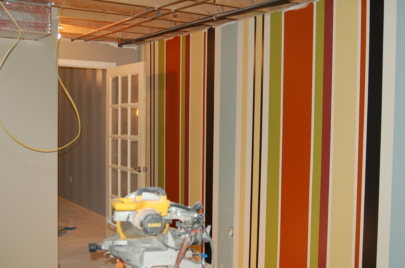
Journey to the Perfect Stripe
How to Make a Headboard {Shutter Headboard}
Design Atelier Article {Giveaway!}

Blue and turquoise table settings

I Heart Fiesta & My Fiesta Hearts Me

Done…for now! {Kitchen Renovation Update}

A Visit to Blue Ridge Flea Market

Tulips & Toile

Patio Furniture Update on a Budget! {and a giveaway}
New stuff

Barn Sale Treasure! {DIY Chalkboard Mirror}

Creating with the Stars Round 4 Voting {The Final Round!}

Birds on Vintage China Patterns

Travel-Inspired Design {Part 1}

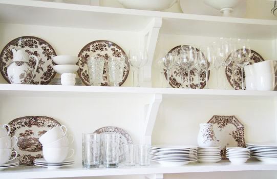
Transfer Ware
Formal Living Room Makeover {Knock It Off}

Red, white and blue

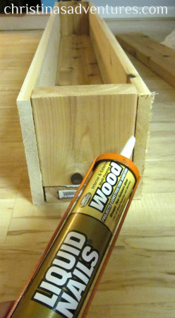
DIY Decorative Flower Trough {Christina's Adventures}
Journey to a Vertical Garden Part 3 {Home Depot #DigIn}