My Creative Blog [Search results for gray kitchen cabinets]
Kitchen Renovation: Before and After
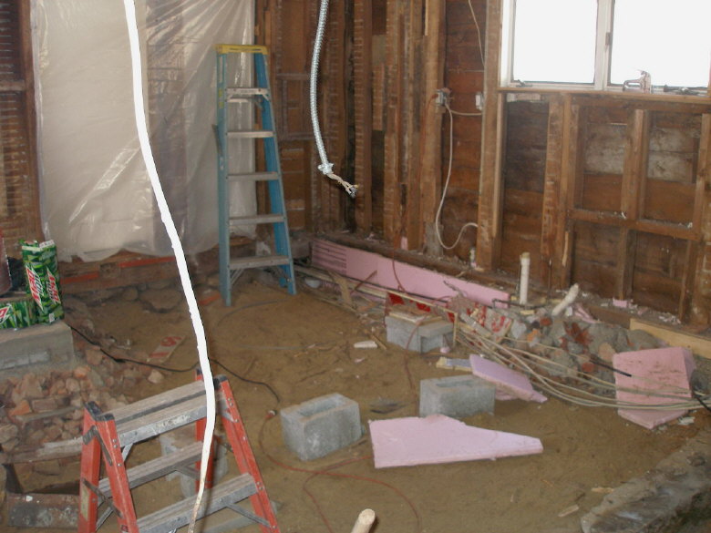
Kitchen Renovation {Putting it Back Together}

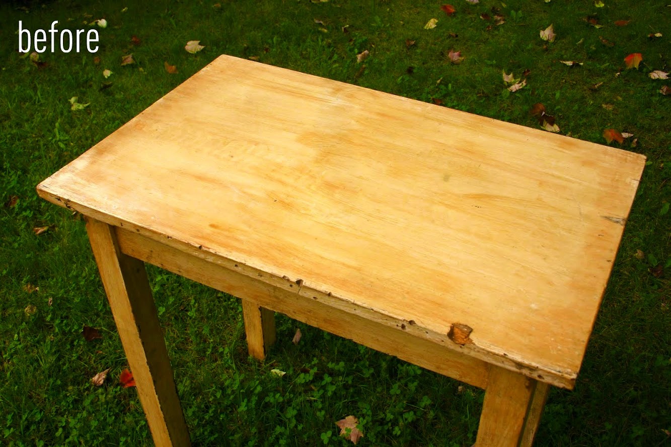
Antique Table Turned Vanity {Bathroom Redesign Update}
Striped Hat Rack {DecoArt Glass Paint}

gimme your grays...

gray kitchen cabinets...

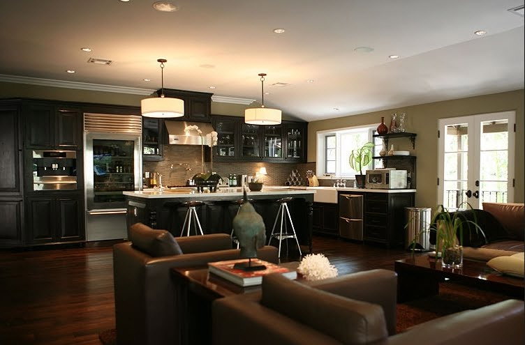
Flipping Out: Jeff Lewis Designs
gray kitchen cabinets

DIY Marquee Sign {Knock It Off Project}

Friday delights: charcoal gray cabinets
